Every brand reaches a tipping point. The logo that worked 10 years ago starts feeling dated. The packaging no longer stands out on the shelf. The corporate identity no longer matches what the company has become.
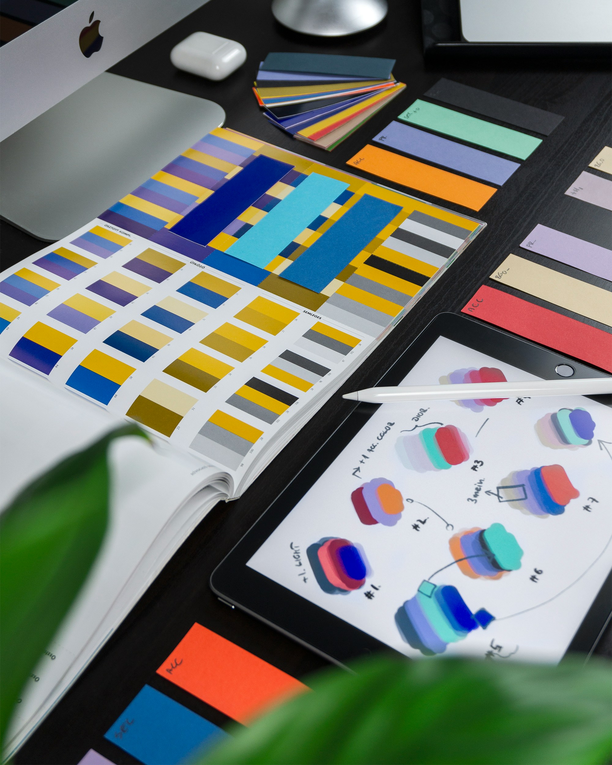
Rebranding is not just about redesigning a logo. It is a complete transformation of how a company presents itself across every touchpoint where the brand can be seen. That means rethinking the collaterals, brochures, website, social media presence, and even the way the company communicates. A true rebrand also revisits typography, colour palettes, and the development of key visuals that help define the brand and give it a unique, recognizable character.
Done well, rebranding breathes new life into an established company without losing the equity built over years of hard work. It is a strategic decision that can redefine how customers, partners, and employees perceive a business.
At Asia Media Studio, we have delivered hundreds of rebranding projects across industries and continents since 2007. In this article, we share six real before-and-after transformations to show what strategic rebranding looks like in practice.
Case Study 1: Brandon Bioscience
A 25-Year Rebrand from the Ground Up
Industry | Agricultural Technology |
Location | Ireland (global distribution to 36+ countries) |
Scope | Complete rebrand: logo, CI, stationery, brochures, fact sheets, booth designs, website, packaging, video, digital marketing, 100+ page brand guideline |

Left: The original Brandon Bioscience identity featured a busy, illustration-heavy visual style with inconsistent layout across materials.
Right: The new brand is clean, confident, and structured. A refined logo, cohesive colour system, modern infographics, and unified packaging (including BARRAMAR product line) create a premium, science-driven presence across all touchpoints.
The Challenge
Brandon Bioscience had operated for 25 years with the same brand identity. Founded in Ireland in 1998, the company had grown into a thriving community of scientists, farmers, and innovators developing precision biostimulants exported to over 36 countries. The original branding no longer matched the scale, scientific credibility, or global reach of the business.
The Transformation
Asia Media Studio led a comprehensive rebrand that went far beyond the logo. The project spanned eight months and touched every customer-facing element of the business.
The new logo and visual identity were designed to project a modern, professional, and trustworthy image. The colour palette, typography, and graphic language were all rebuilt from scratch. Custom infographics and icons were created to communicate complex scientific content in a visually engaging way.
From there, the team rolled out the identity across stationery, marketing brochures, technical fact sheets, trade show booth designs, product packaging, and a completely new corporate website. We also take care of all video production and animated content related to the communication of their brands.
The Result
The entire rebrand was documented in a detailed brand guideline manual spanning over 100 pages. The client's Marketing Manager noted that the design work brought the brand to the next level and exceeded expectations.
The collaboration has continued for over four years. Asia Media Studio handles ongoing design work on a monthly basis, including all SEO management and, more recently, online digital marketing visuals. Brandon Bioscience also recommended AMS to their sister company, Hebridean Seaweed, for a similar transformation.
Case Study 2: Oreco
Building a Modern Industrial Identity
Industry | Industrial Solutions / Environmental Technology |
Location | Denmark (global operations) |
Scope | Logo design, brand guidelines, communication assets, website redesign, digital and corporate materials, ongoing maintenance |
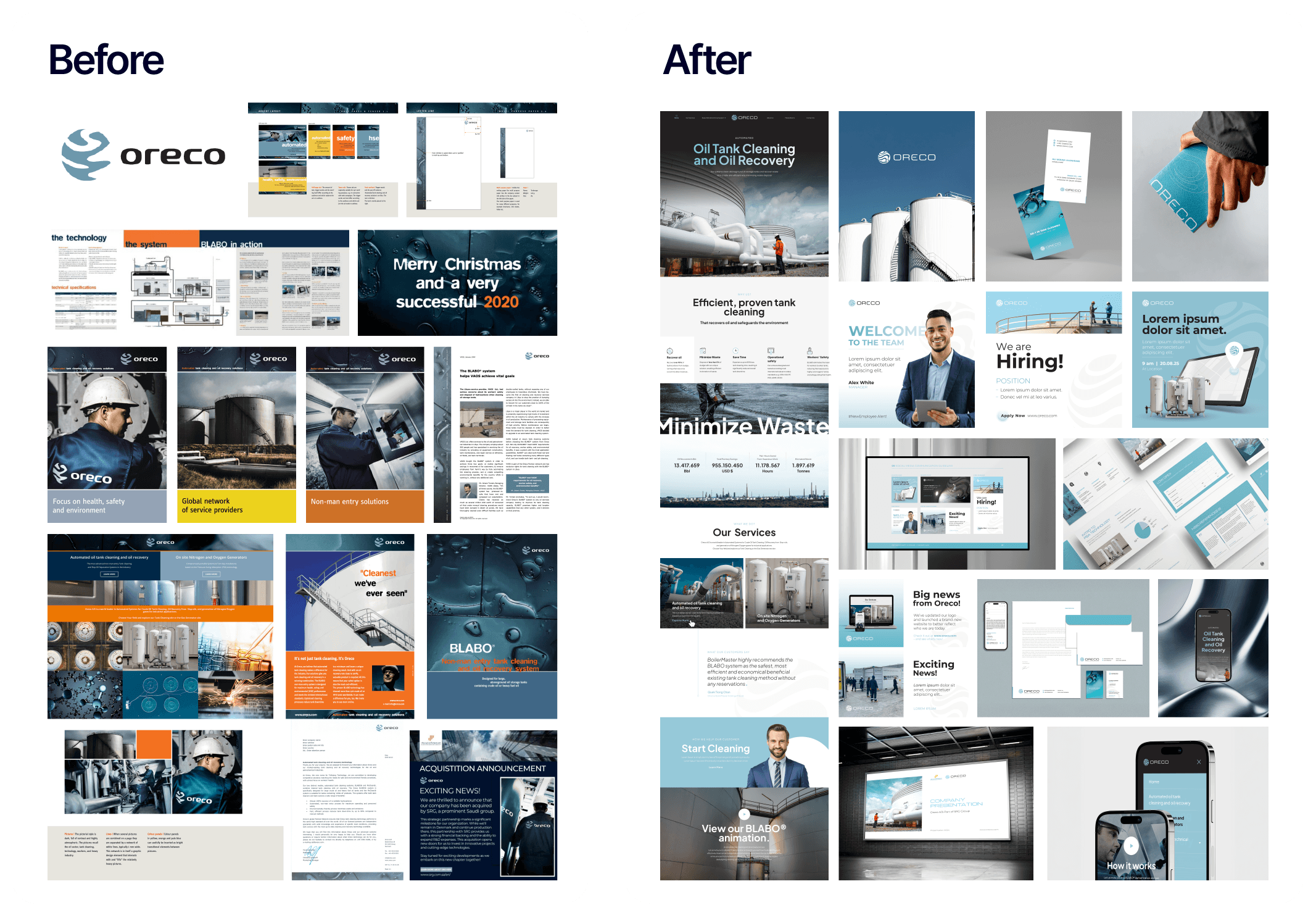
Left: The previous Oreco identity relied on dense text-heavy documents, dated layouts, and an inconsistent visual approach across brochures and presentations.
Right: A clean, modern system with a refreshed logo, bold photography, structured website pages, professional recruitment materials, and a unified teal-and-white colour scheme that communicates precision and environmental responsibility.
The Challenge
Oreco specializes in sustainable tank cleaning and recovery solutions, with decades of expertise in industrial efficiency and environmental responsibility. The company needed a brand identity that communicated reliability, engineering precision, and technological expertise to a global B2B audience.
The Transformation
Asia Media Studio crafted a modern corporate identity built around a clean, structured visual system. The design language was deliberately minimal and professional, reflecting the precision engineering at the heart of Oreco's business.
The new logo, brand guidelines, and communication assets were developed to ensure consistency across corporate materials and digital platforms. A complete website redesign was also a challenging and rewarding part of the project, giving Oreco a professional digital presence that matches the quality of their services.
The Result
The revitalized identity provides Oreco with a cohesive and professional presence across all channels. AMS continues to support Oreco with monthly website maintenance, ensuring the platform stays secure, fast, and up to date. The brand guideline ensures that whether the company is presenting at a trade show in Europe or sending a proposal to a client in Asia, the message and visual language remain consistent.
Case Study 3: Mahanakorn Partners Group
Modernizing a Professional Services Brand
Industry | Legal, Accounting, Tax Advisory, and Business Consulting |
Location | Bangkok, Thailand (operations in 6 Southeast Asian countries) |
Scope | Complete logo redesign, dual-language website, stationery, company profile, presentations, seminar visuals, Google Ads, ongoing monthly support |
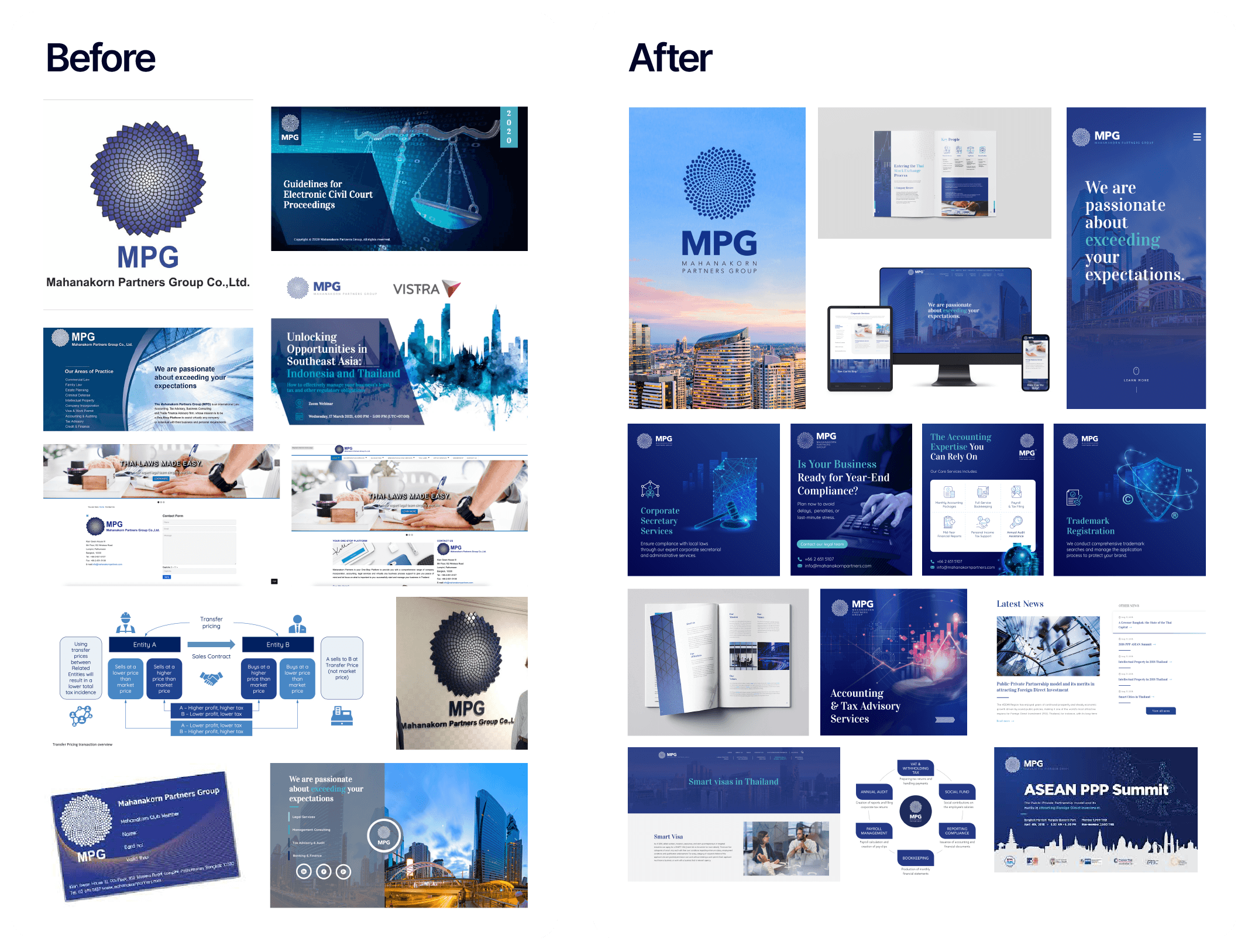
Left: The previous MPG identity featured a detailed Fibonacci spiral logo, traditional layouts, and presentation materials that lacked visual cohesion.
Right: A refined, contemporary logo retains the Fibonacci inspiration while delivering a cleaner, bolder mark. The new website, social media templates, company profile, and seminar materials present a unified, authoritative corporate image.
The Challenge
Established in 1999, Mahanakorn Partners Group (MPG) had grown into a leading professional services firm with presence in six Southeast Asian countries and alliances across Asia Pacific and Europe. The company needed its visual identity to match its market position as a trusted, modern, and authoritative firm.
The Transformation
Asia Media Studio was appointed to completely modernize MPG's visual identity and brand proposition. The original logo, inspired by 13th-century mathematician Leonardo Fibonacci's arithmetic sequence, was redefined in meticulous detail. The Fibonacci element, symbolizing efficiency and attention to detail, was retained but refined to feel contemporary and bold.
A distinctive typeface was paired with the new logo to create a strong, business-like impression that mirrors MPG's confident market leadership. The new brand was then rolled out across a complete website, designed for clear navigation and professional authority.
The Result
AMS has been collaborating with MPG for over seven years. Beyond the initial rebrand, we support the client on ongoing monthly tasks across design and communication needs. We also manage all their Google Ads campaigns on a monthly basis and handle full website maintenance. MPG's Managing Partner praised the redesign for perfectly capturing the firm's multidisciplinary practice and expressing its core values.
Case Study 4: Sistomat
Modernizing a Thai Automation Pioneer
Industry | Industrial Automation / Manufacturing Technology |
Location | Pathum Thani, Thailand |
Scope | Brand strategy, logo redesign, brand guideline, website redesign, SEO |

Left: The old Sistomat identity used a dated 3D-effect logo, cluttered business cards, dense product photography, and inconsistent marketing materials under the Siam Integration Systems parent brand.
Right: A sleek, modern wordmark with a refined symbol, paired with a professional website, structured brochure layouts, social media templates, and a bold brand tagline 'Tailored for Future Success' that positions the company as an innovation leader.
The Challenge
Sistomat, operating under Siam Integration Systems, has over 22 years of experience designing and building custom automation machinery, tools, and components for manufacturing and testing processes. Serving industries such as electronics and automotive with a team of 100+ employees, the company had built a strong reputation for engineering excellence. However, the existing brand identity did not reflect the company's technological leadership or its scale of operations.
The Transformation
Asia Media Studio developed a complete brand modernization for Sistomat. The project began with brand strategy to define how the company should be perceived in its market, followed by a logo redesign that brought a contemporary, technology-forward look to the identity.
A comprehensive brand guideline was created to ensure consistency across all applications. The new visual system communicates precision and innovation. A redesigned website was built to showcase the company's capabilities with a professional, modern aesthetic, supported by SEO optimization to strengthen online visibility.
The Result
The rebrand positions Sistomat as a modern, forward-thinking automation leader. The cohesive identity across brand guideline, website, and marketing materials gives the company a professional presence that matches its technical expertise and two decades of industry experience.
Case Study 5: La Vanille
From Artisan Roots to a Bold New Identity
Industry | Consumer Goods / Food and Beverage |
Location | Thailand |
Scope | Brand identity refresh, packaging redesign, e-commerce website (WordPress), social media, brochure and flyer design, packaging production support |
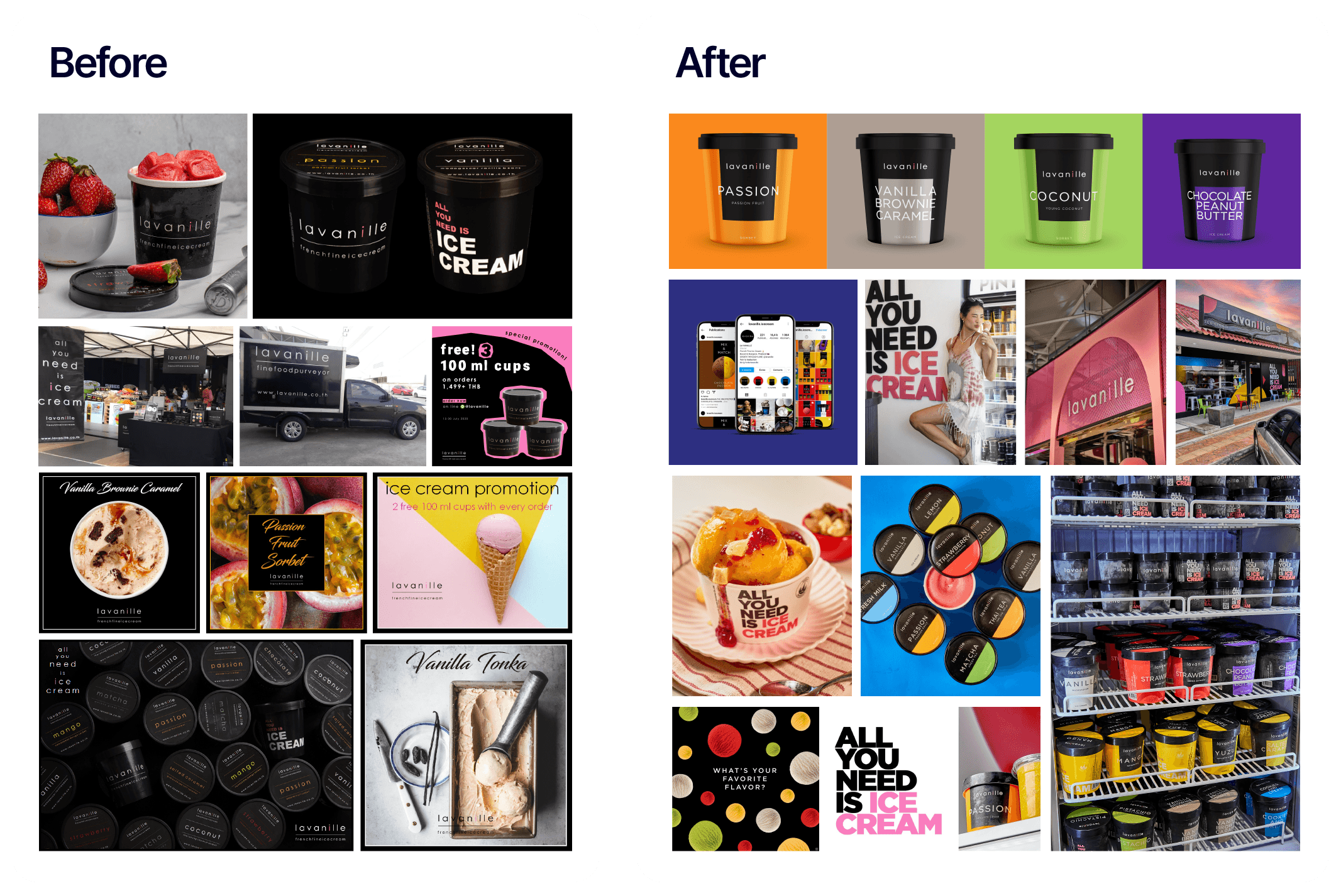
Left: The previous La Vanille look featured dark, moody photography, script fonts, and a premium-artisan aesthetic that worked for B2B hotel supply but lacked retail shelf impact.
Right: The new identity is chic, simple, and premium. Vibrant, flavour-coded packaging in bold orange, green, pink, and purple makes each product pop on retail shelves. A modern storefront, lifestyle photography, and the confident tagline 'All You Need Is Ice Cream' complete a brand built for direct-to-consumer success.
The Challenge
La Vanille has been creating unique ice cream and sorbet flavours since 2008. The company sources the best quality ingredients and supplies homemade ice cream to restaurants, five-star hotels, and online consumers. As the brand expanded from B2B hotel supply into direct-to-consumer sales, it needed a refreshed identity and packaging that could compete on retail shelves and in social media feeds.
The Transformation
Asia Media Studio has worked with La Vanille since 2020, initially updating packaging, website, social media, brochure, and flyer design over a 12-week engagement. The packaging was designed to be chic, simple, and premium. Colours were refined to match specific flavours while working in harmony when products sit side by side in the fridge or on the shelf.
We also supported the client with the production of their packaging, managing the transition from design to physical product. A full e-commerce website was developed on WordPress, allowing customers to order ice cream directly for home delivery.
Most recently, AMS is developing a completely new brand identity for La Vanille, taking the evolution a step further with a fresh visual system that builds on years of collaboration and market insight.
The Result
The redesign has had a direct impact on increasing sales, which we are proud of. The ongoing partnership has transformed La Vanille from a behind-the-scenes hotel supplier into a recognizable consumer brand. The refreshed packaging, engaging online presence, and consistent visual identity across all touchpoints have supported the company's growth into direct-to-consumer sales while maintaining its premium positioning with hospitality clients.
Case Study 6: Yoma Wood
Transforming a Wood Products Brand
Industry | Construction Materials / Wood Products |
Location | Thailand |
Scope | Brand guideline development, logo redesign, visual identity system, company presentation, marketing collaterals |
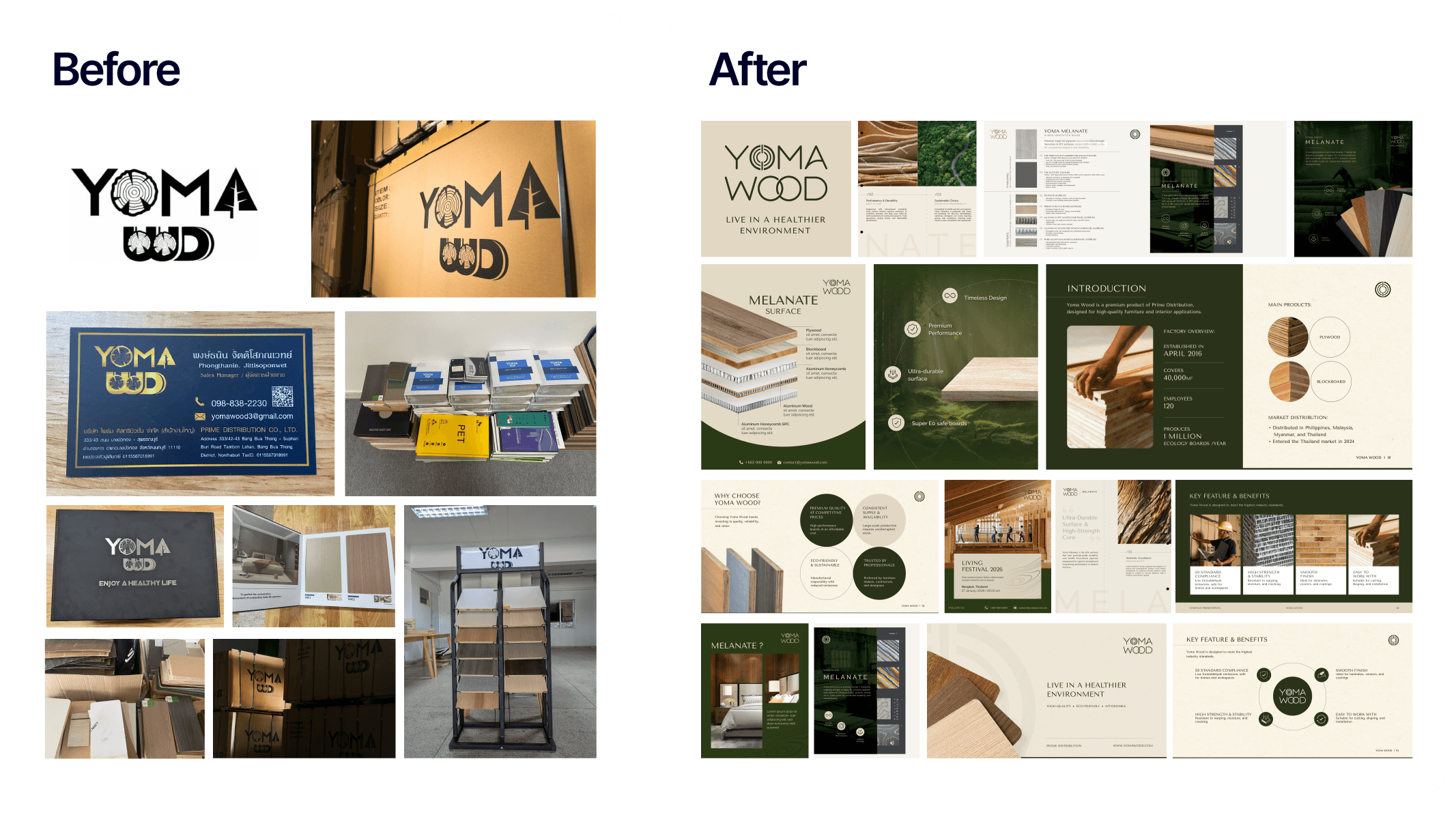
Left: The old Yoma Wood identity used a heavy, hand-drawn logo with limited visual system. Business cards, signage, and showroom materials lacked cohesion, and the overall brand presence felt inconsistent.
Right: A refined, nature-inspired logo and a sophisticated dark-green-and-cream colour palette elevate the brand. The new system includes a professional company presentation, product catalogues featuring their Melanate Surface line, feature-and-benefit layouts, and a key visual language rooted in wood textures and craftsmanship.
The Challenge
Yoma Wood operates in the competitive Thai construction materials and wood products industry. Established in 2016, the company distributes premium wood products across the Philippines, Malaysia, Myanmar, and Thailand. To strengthen its market position and differentiate from competitors, the company needed a professional, cohesive brand identity that communicated quality, reliability, and craftsmanship.
The Transformation
Asia Media Studio developed a complete brand guideline for Yoma Wood, creating a visual identity system that balances the natural, organic qualities of wood products with the professionalism expected in the construction industry.
The identity was built around a refined logo and a sophisticated colour palette that works across business cards, product catalogues, signage, and marketing materials. A comprehensive company presentation was designed to showcase their product lines, factory capabilities, and market distribution. Key visual elements were developed to give the brand a distinctive, premium character.
The Result
The new brand guideline gives Yoma Wood a solid foundation for growth. With a clear, professional identity in place, the company can now present a consistent image to clients, partners, and distributors across Southeast Asia, building trust and recognition in a market where quality perception matters.
What Makes a Rebrand Successful?
Looking across these six transformations, several common principles emerge.
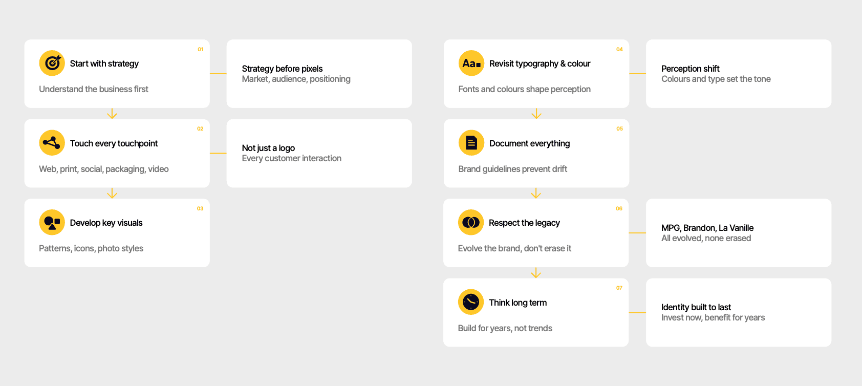
Start with strategy, not design. Every successful rebrand begins with understanding the business, its market, and its audience. The visual identity flows from the strategy, not the other way around.
Touch every touchpoint. A new logo alone does not constitute a rebrand. The identity must be applied consistently across all materials: logo, stationery, website, packaging, presentations, social media, signage, and even video and animation. Every customer interaction should feel unified.
Develop key visuals. Beyond the logo, successful brands create distinctive visual elements, patterns, icons, and photography styles that make the brand instantly recognizable. These key visuals give the brand a unique character that goes far beyond a logomark.
Revisit typography and colour. The typefaces and colours a brand uses shape perception more than most people realize. Refreshing these foundational elements can dramatically shift how a brand feels without changing its core identity.
Document everything. A brand guideline is not optional. Without clear documentation, brand consistency erodes over time as different teams and partners interpret the identity differently.
Respect the legacy. The best rebrands evolve a brand rather than erasing it. MPG kept its Fibonacci inspiration. Brandon Bioscience maintained its scientific credibility. La Vanille preserved its artisan warmth. A rebrand should feel like a natural progression, not a rejection of what came before.
Think long term. A rebrand is an investment. The goal is to create an identity that will serve the company for years to come, not just look trendy today.
Ready to Transform Your Brand?
Whether your logo feels outdated, your packaging needs a refresh, or your entire brand identity needs a strategic overhaul, the right partner makes all the difference.
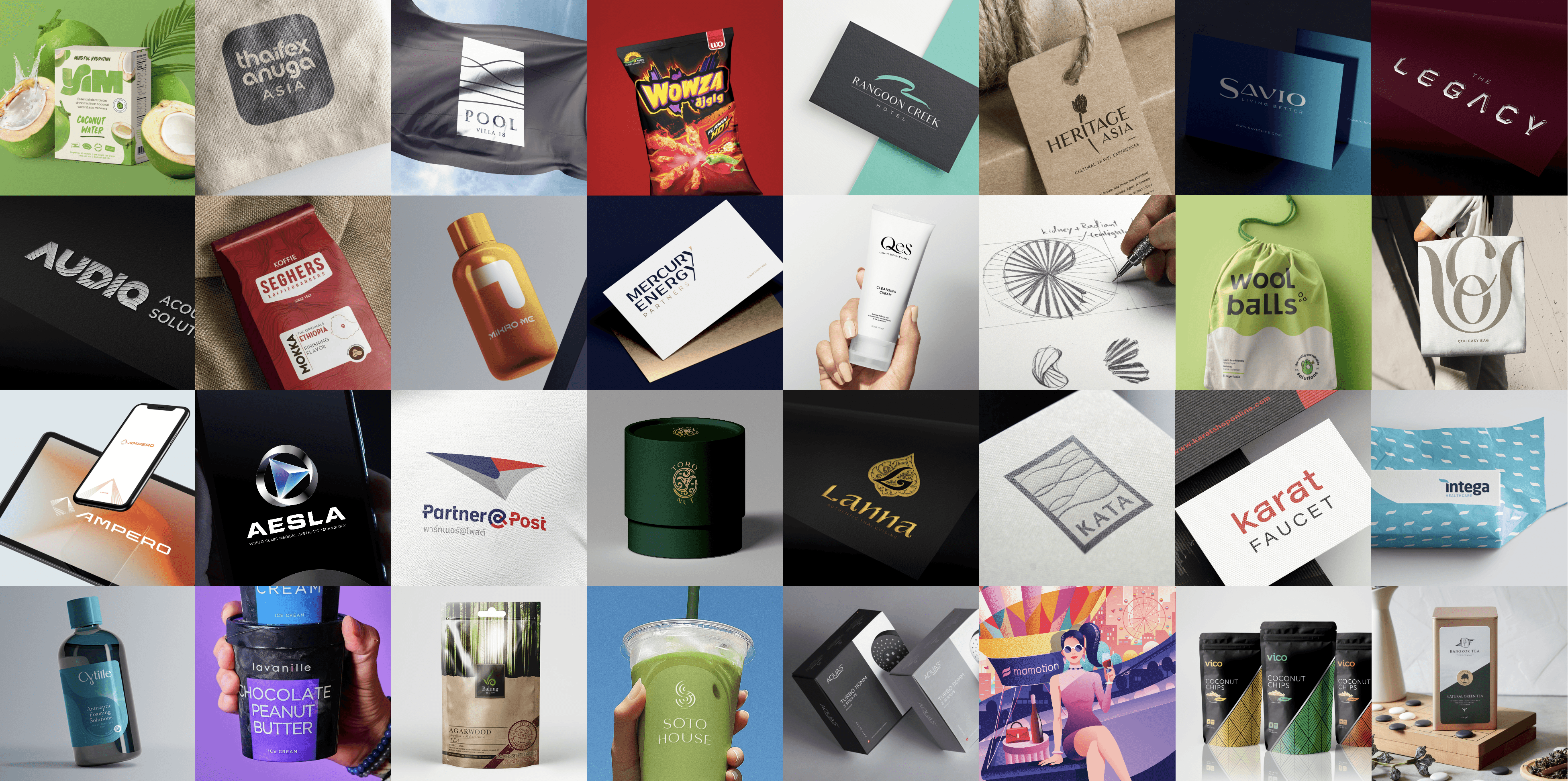
Asia Media Studio has been helping businesses across Asia and beyond build brands that connect, differentiate, and grow since 2007. With a team of 30+ professionals and a portfolio of over 500 projects, we bring both experience and creativity to every engagement.
Explore our branding portfolio to see more transformations, or get in touch to discuss your project.


Let’s keep in touch.
Follow Asia Media Studio for design insights and updates on Facebook, Instagram, and LinkedIn.


