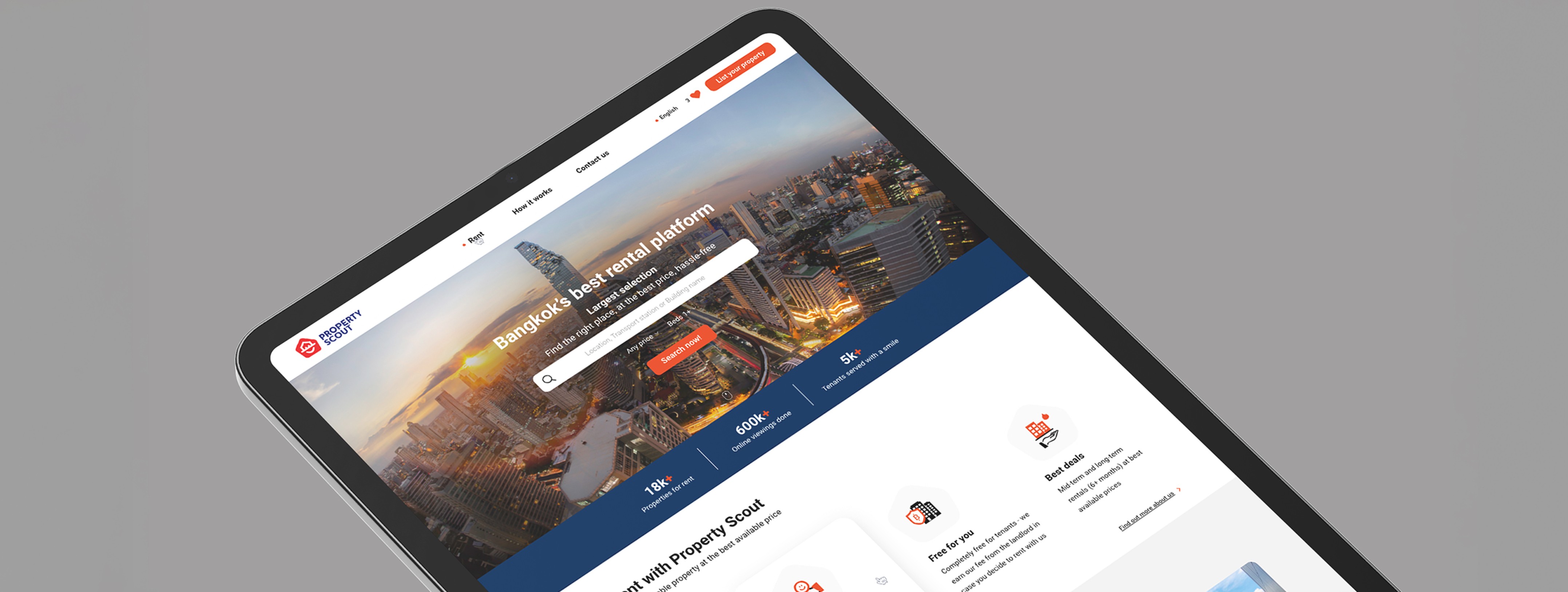
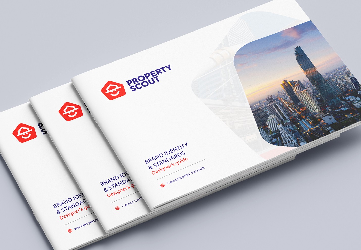
As the initial phase of this project, we were actively engaged in the naming process. Upon the confirmation of the name “Property Scout,” our focus shifted to the branding identity that seamlessly embodies the name’s essence. We blended real estate imagery, symbolized by houses, with the iconic visuals of the Boy Scouts. Subsequently, we streamlined our efforts by establishing a comprehensive brand guideline.


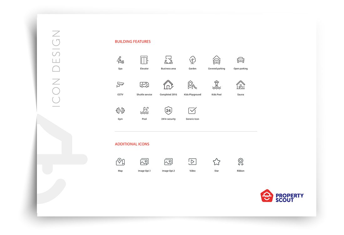
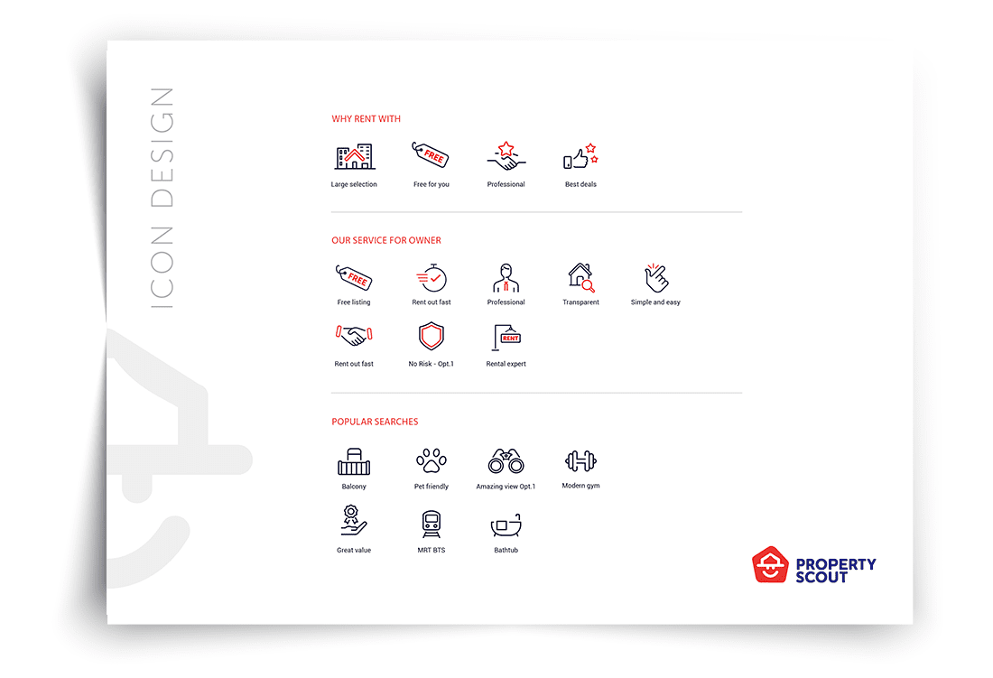
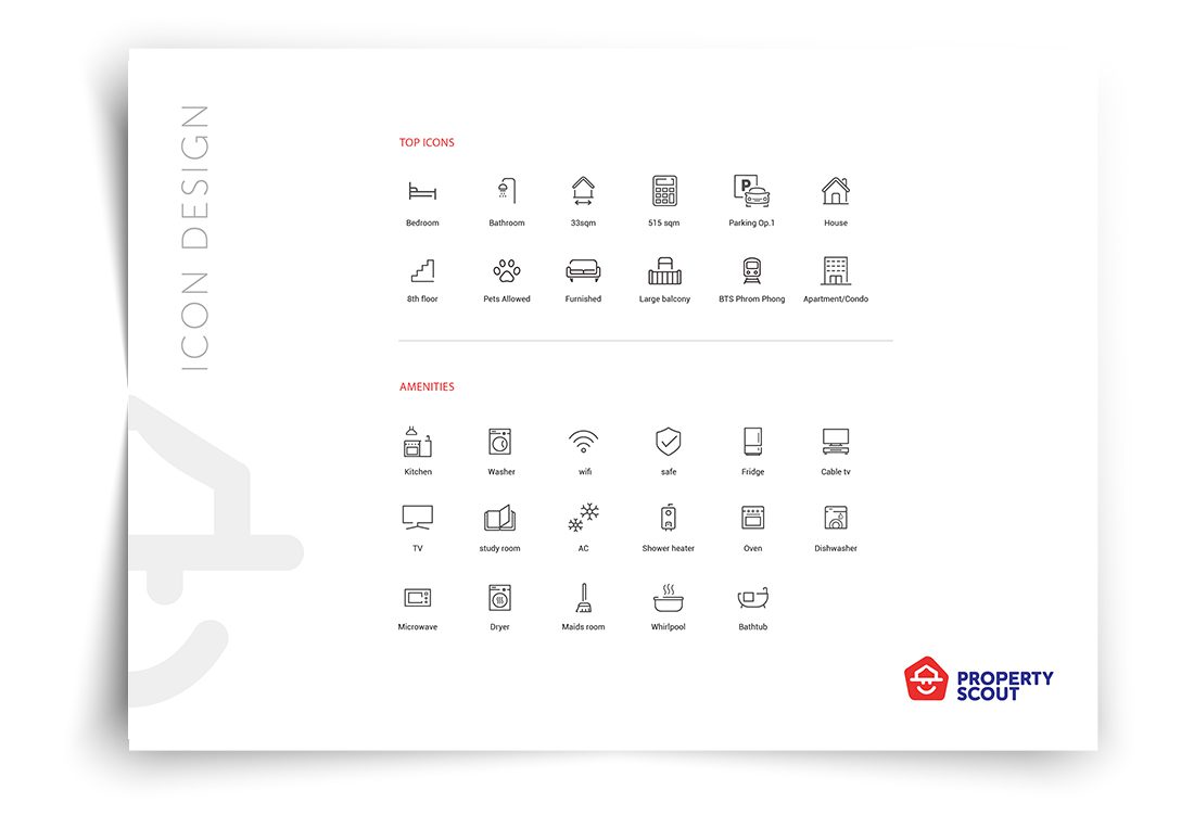
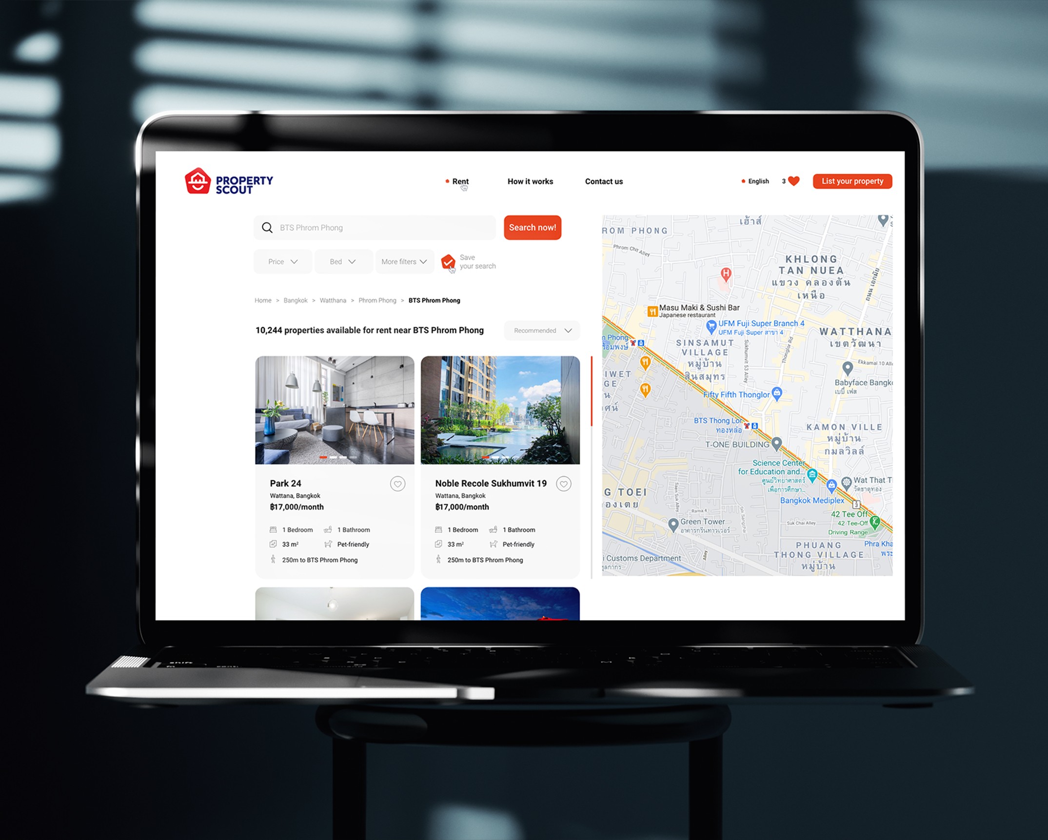
As an integral part of our branding strategy, we dedicated ourselves to the creation of a series of icons tailored for online communication. Over 60 unique icons, all intricately linked to the property industry, were meticulously designed. Each icon received a customized and distinct treatment to align seamlessly with our client’s unique branding, ensuring a cohesive and exclusive visual identity.