
การออกแบบการสื่อสาร
การออกแบบการสื่อสาร
เอเจนซี่ออกแบบการสื่อสารในกรุงเทพฯ ประเทศไทย
เราเปลี่ยนอัตลักษณ์ของแบรนด์ให้กลายเป็นสื่อที่ผู้คนสามารถสัมผัส อ่าน และพบเห็นได้จริง ไม่ว่าจะเป็นโบรชัวร์ บรรจุภัณฑ์ สื่อโฆษณา หรือแคมเปญต่าง ๆ
เราดูแลตั้งแต่การออกแบบไปจนถึงการผลิตจริง ตั้งแต่โบรชัวร์องค์กรและแคตตาล็อกสินค้า ไปจนถึงบรรจุภัณฑ์สำหรับค้าปลีกและสื่อโฆษณา เราผสานความเชี่ยวชาญด้านการจัดวาง การถ่ายภาพ และการบริหารงานผลิต เพื่อสร้างสื่อที่สอดคล้องกับอัตลักษณ์ของแบรนด์ พร้อมสำหรับการผลิต และโดดเด่นทั้งบนชั้นวางสินค้าและในสื่อสิ่งพิมพ์
ตั้งแต่แบรนด์ดังระดับโลกไปจนถึงแบรนด์ท้องถิ่นที่เป็นที่ชื่นชอบ นี่คือส่วนหนึ่งของแบรนด์ที่เราออกแบบสื่อสิ่งพิมพ์และโฆษณาให้







บริการการสื่อสาร.
บริการการสื่อสาร.
การออกแบบโบรชัวร์
การออกแบบโบรชัวร์
เราออกแบบโบรชัวร์องค์กร แคตตาล็อกสินค้า และสื่อการขายที่มีโครงสร้างชัดเจน อ่านง่าย และสะท้อนภาพลักษณ์ของแบรนด์อย่างมืออาชีพ ตั้งแต่การจัดวางเนื้อหา การออกแบบกราฟิก ไปจนถึงการถ่ายภาพและการผลิต เราสามารถดูแลกระบวนการทั้งหมดเพื่อให้สื่อของคุณพร้อมใช้งานตั้งแต่ต้นจนจบ
โบรชัวร์องค์กร
แคตตาล็อกสินค้า
สื่อการตลาดและสื่อการขาย
โบรชัวร์ดิจิทัล
การถ่ายภาพและการเขียนข้อความ
การผลิตสื่อสิ่งพิมพ์


การออกแบบบรรจุภัณฑ์
การออกแบบบรรจุภัณฑ์
บรรจุภัณฑ์ที่ดีต้องโดดเด่นบนชั้นวางสินค้าและสามารถนำไปผลิตจริงได้อย่างสมบูรณ์แบบ เราพัฒนา Key Visual ที่สร้างความแตกต่างในหมวดหมู่สินค้า พร้อมจำลองการใช้งานด้วย 3D Rendering ก่อนการผลิตจริง และปรับใช้กับทุกรสชาติ สูตร และขนาดบรรจุภัณฑ์อย่างสอดคล้องกัน ไฟล์งานที่ส่งมอบพร้อมสำหรับการผลิต และได้รับการตรวจสอบให้สอดคล้องกับข้อกำหนดของผู้ผลิตอย่างละเอียด
การออกแบบ Key Visual
3D Rendering และ Mockup
การปรับรูปแบบและขนาด
การถ่ายภาพสินค้า
Dieline และไฟล์ Artwork พร้อมพิมพ์
การบริหารจัดการการผลิต
การออกแบบโฆษณา
การออกแบบโฆษณา
เราสร้างแคมเปญจากแนวคิดหลักที่สามารถนำไปใช้ได้อย่างสอดคล้องในทุกช่องทาง ตั้งแต่การพัฒนา Key Visual และข้อความหลัก ไปจนถึงการปรับใช้กับสื่อสิ่งพิมพ์ สื่อกลางแจ้ง และสื่อดิจิทัล เพื่อให้แคมเปญของคุณเป็นที่จดจำไม่ว่าจะปรากฏในรูปแบบใด ทีมงานของเราดูแลทั้งการถ่ายภาพ Art Direction และการจัดทำ Artwork เพื่อให้ทุกองค์ประกอบของแคมเปญสื่อสารไปในทิศทางเดียวกัน
การพัฒนา Key Visual
สื่อสิ่งพิมพ์และสื่อกลางแจ้ง
สื่อดิจิทัลและโซเชียลมีเดีย
การเขียนข้อความสำหรับแคมเปญ
การถ่ายภาพและ Art Direction
Artwork และการผลิต

ผลงานที่เราได้ออกแบบ
จุดแข็งของ AMS อยู่ที่บุคลากรของเรา ทีมงานที่มีความหลากหลายทางวัฒนธรรมของเรา ซึ่งประกอบไปด้วยนักออกแบบ นักวางกลยุทธ์ และนักการตลาด ได้นำมุมมองที่หลากหลายและความมุ่งมั่นร่วมกันมาสู่ทุกๆ โปรเจกต์ การทำงานร่วมกัน ความอยากรู้อยากเห็น และความมุ่งมั่นทุ่มเท ขับเคลื่อนให้เราก้าวไปไกลกว่าความคาดหวัง
จุดแข็งของ AMS อยู่ที่บุคลากรของเรา ทีมงานที่มีความหลากหลายทางวัฒนธรรมของเรา ซึ่งประกอบไปด้วยนักออกแบบ นักวางกลยุทธ์ และนักการตลาด ได้นำมุมมองที่หลากหลายและความมุ่งมั่นร่วมกันมาสู่ทุกๆ โปรเจกต์ การทำงานร่วมกัน ความอยากรู้อยากเห็น และความมุ่งมั่นทุ่มเท ขับเคลื่อนให้เราก้าวไปไกลกว่าความคาดหวัง
จุดแข็งของ AMS อยู่ที่บุคลากรของเรา ทีมงานที่มีความหลากหลายทางวัฒนธรรมของเรา ซึ่งประกอบไปด้วยนักออกแบบ นักวางกลยุทธ์ และนักการตลาด ได้นำมุมมองที่หลากหลายและความมุ่งมั่นร่วมกันมาสู่ทุกๆ โปรเจกต์ การทำงานร่วมกัน ความอยากรู้อยากเห็น และความมุ่งมั่นทุ่มเท ขับเคลื่อนให้เราก้าวไปไกลกว่าความคาดหวัง
พาชมโบรชัวร์ บรรจุภัณฑ์ และแคมเปญต่าง ๆ ที่เราได้สร้างสรรค์ขึ้นในหลากหลายอุตสาหกรรม

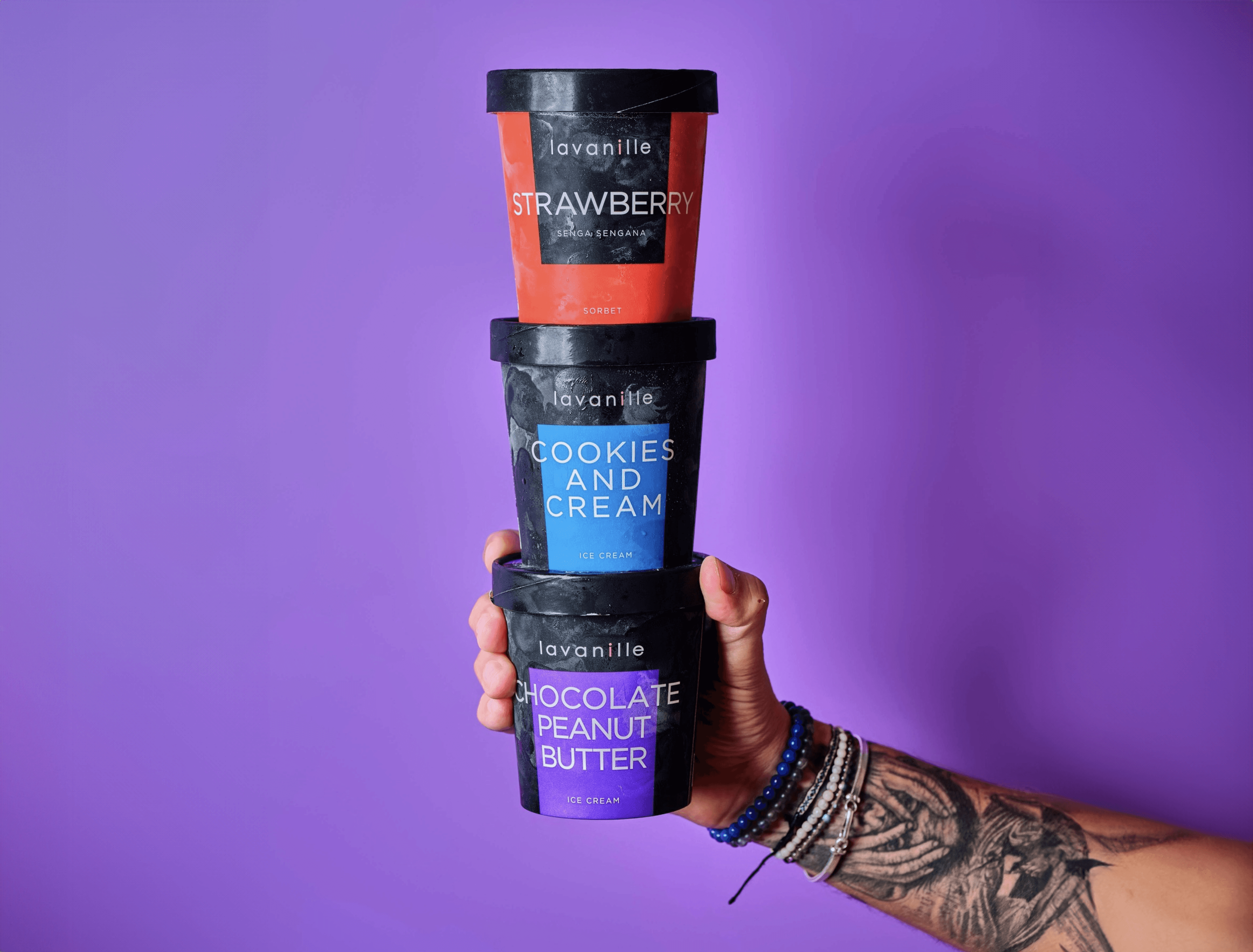
Ice cream packaging design and print collateral
La Vanille has been creating ice cream and sorbet flavours since 2008, supplying restaurants, five-star hotels and now online. We have worked with them since 2020 across packaging, brochure and flyer design. For the packaging, the aim was to transmit the freshness you feel from a scoop of ice cream: colours were refined flavour by flavour, from vanilla brownie caramel to yuzu, so each pack is instantly identifiable and the range still works in harmony on the shelf.
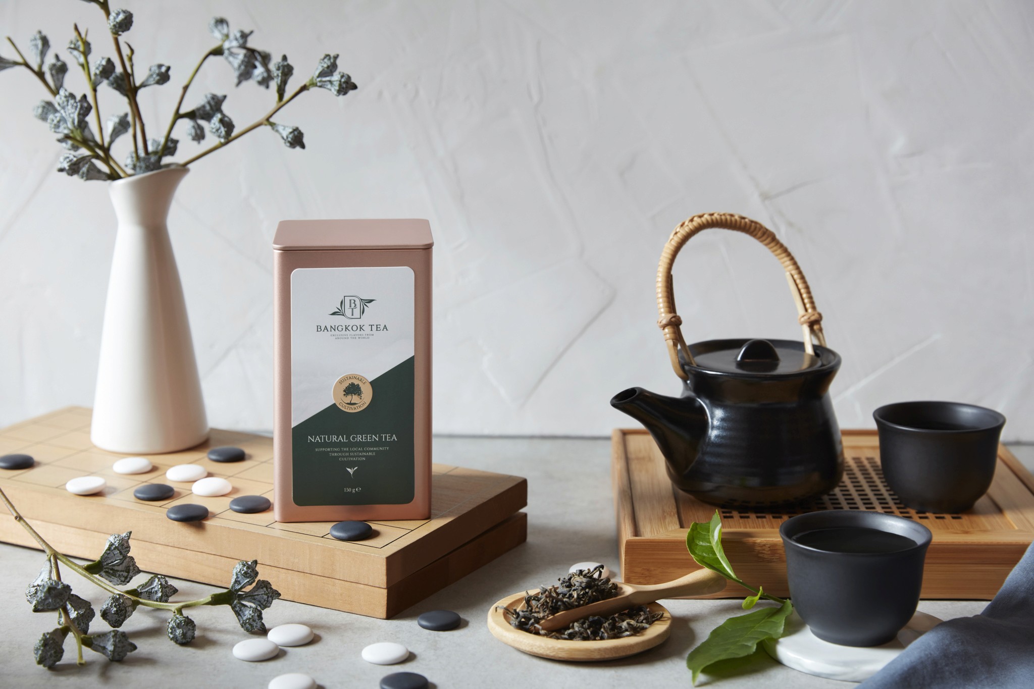
Premium tea packaging design and brochure design
Bangkok Tea blends and packages premium organic teas, fusions, kombucha and tea-based spreads. We have built deep packaging knowledge in the food and beverage market, and worked closely with the client to develop a range that suits their innovative products. The aluminium container gave us scope for high-impact pack design: the logo stands out boldly, colours are powerful and luxurious, and packs are colour-coded for easy product identification. We also wrote the content on the back of each container.
Key visual and packaging design for snacks
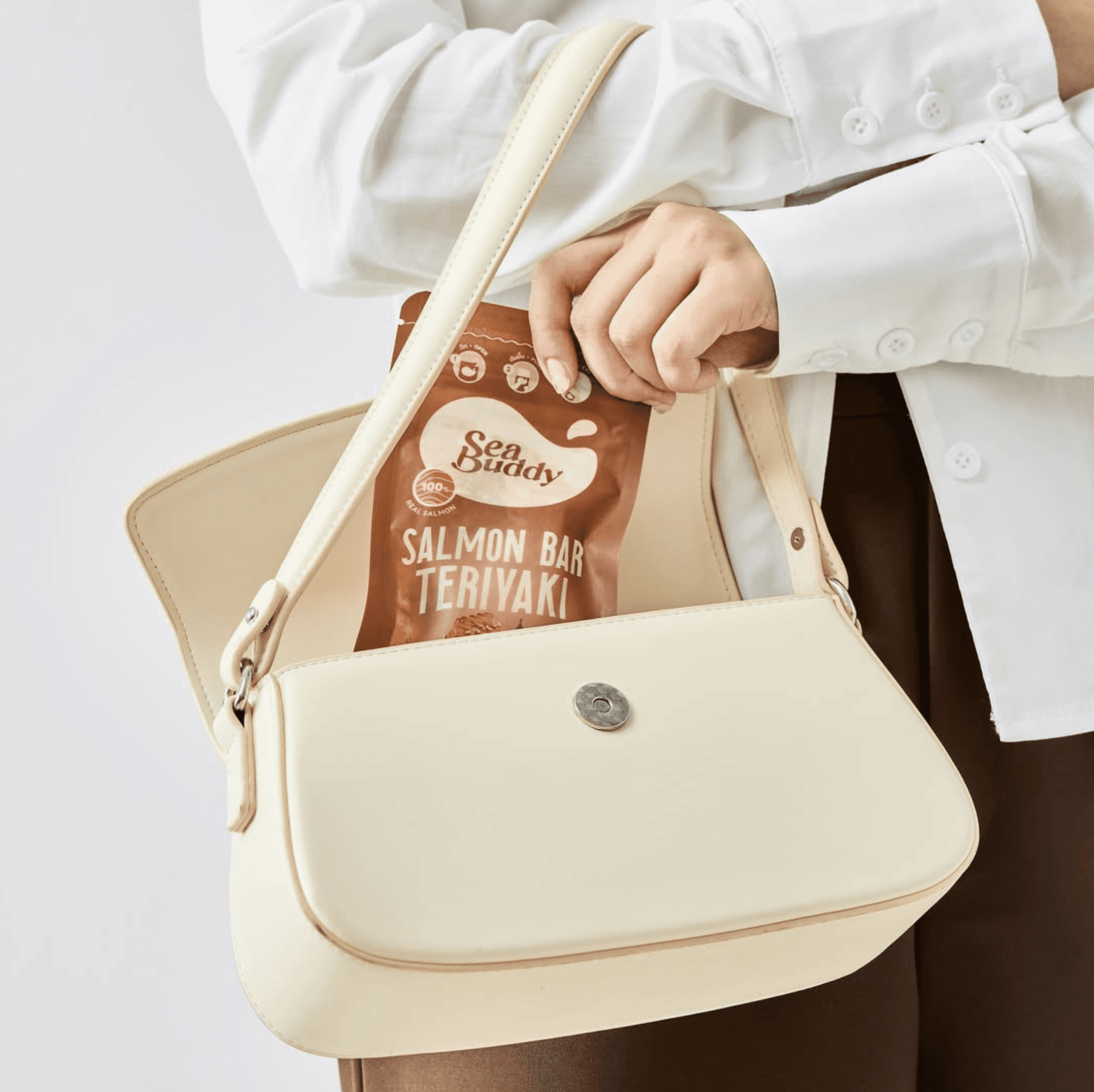
Sea Buddy makes ready-to-eat salmon snack bars for health-conscious consumers. After designing their new logo, our second task was to create the key visuals for packaging and marketing materials, crafting simple but striking imagery supported by careful photo retouching to lift product appeal. Once the key visual was approved, we integrated it into packaging for both box and sachet formats, adapted per flavour, including precision die-cut artwork. In total we delivered six unique packaging designs.
Can packaging design and key campaign visuals
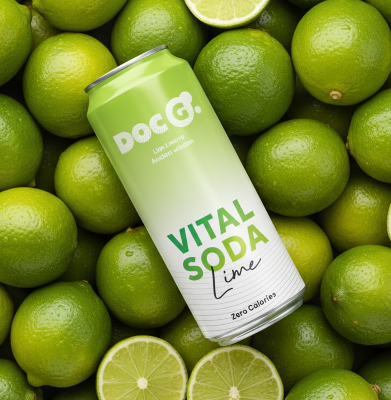
Doc G. is a Swiss functional soda blending Lion's Mane extracts with modern science, aimed at urban Swiss youth. We built the brand from scratch, then carried it into every printed and visual touchpoint. Packaging design, print collateral and the website ran in parallel to keep one consistent language, from the 330 ml slim can to digital. The can pairs bold typography with an energetic palette and clear flavour navigation across three lines: Mind Blow, Chill Out and Keep Going.
Print and marketing collateral for coffee brands
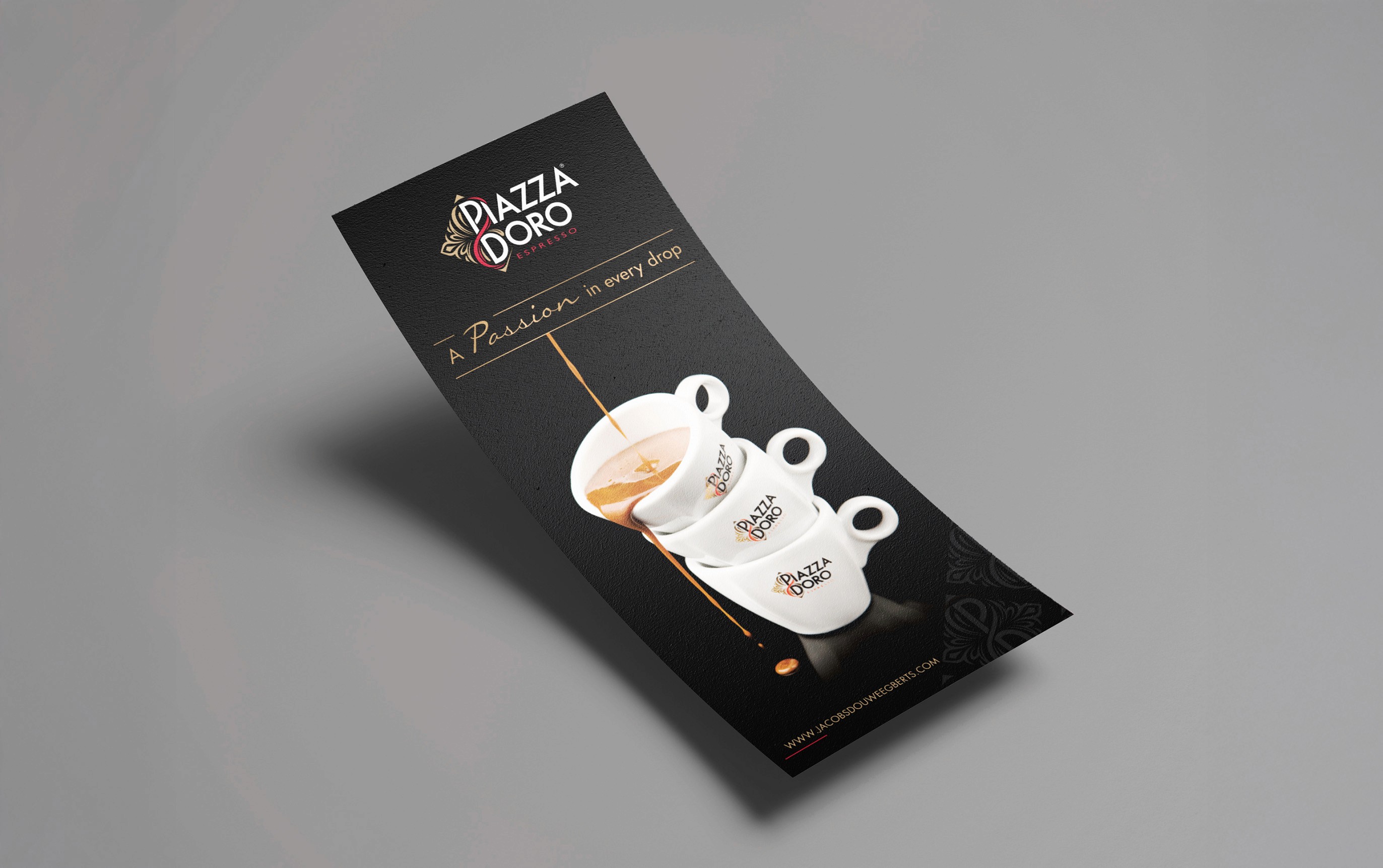
Jacobs Douwe Egberts is part of the largest pure-play coffee and tea company in the world, with Mocona, Pickwick, Douwe Egberts, L'OR and Piazza Doro in its Thailand portfolio. One of our original clients, JDE has worked with us for over a decade. That knowledge of the coffee market shapes a vast range of marketing collateral: brochures, flyers, infographics, menus and banners, plus visual support for each sub-brand and retail coffee kiosks designed for hotels, conferences and exhibitions.
Ice cream packaging design and print collateral
La Vanille has been creating ice cream and sorbet flavours since 2008, supplying restaurants, five-star hotels and now online. We have worked with them since 2020 across packaging, brochure and flyer design. For the packaging, the aim was to transmit the freshness you feel from a scoop of ice cream: colours were refined flavour by flavour, from vanilla brownie caramel to yuzu, so each pack is instantly identifiable and the range still works in harmony on the shelf.
Premium tea packaging design and brochure design
Bangkok Tea blends and packages premium organic teas, fusions, kombucha and tea-based spreads. We have built deep packaging knowledge in the food and beverage market, and worked closely with the client to develop a range that suits their innovative products. The aluminium container gave us scope for high-impact pack design: the logo stands out boldly, colours are powerful and luxurious, and packs are colour-coded for easy product identification. We also wrote the content on the back of each container.
Key visual and packaging design for snacks
Sea Buddy makes ready-to-eat salmon snack bars for health-conscious consumers. After designing their new logo, our second task was to create the key visuals for packaging and marketing materials, crafting simple but striking imagery supported by careful photo retouching to lift product appeal. Once the key visual was approved, we integrated it into packaging for both box and sachet formats, adapted per flavour, including precision die-cut artwork. In total we delivered six unique packaging designs.
Can packaging design and key campaign visuals
Doc G. is a Swiss functional soda blending Lion's Mane extracts with modern science, aimed at urban Swiss youth. We built the brand from scratch, then carried it into every printed and visual touchpoint. Packaging design, print collateral and the website ran in parallel to keep one consistent language, from the 330 ml slim can to digital. The can pairs bold typography with an energetic palette and clear flavour navigation across three lines: Mind Blow, Chill Out and Keep Going.
Print and marketing collateral for coffee brands
Jacobs Douwe Egberts is part of the largest pure-play coffee and tea company in the world, with Mocona, Pickwick, Douwe Egberts, L'OR and Piazza Doro in its Thailand portfolio. One of our original clients, JDE has worked with us for over a decade. That knowledge of the coffee market shapes a vast range of marketing collateral: brochures, flyers, infographics, menus and banners, plus visual support for each sub-brand and retail coffee kiosks designed for hotels, conferences and exhibitions.
Ice cream packaging design and print collateral
La Vanille has been creating ice cream and sorbet flavours since 2008, supplying restaurants, five-star hotels and now online. We have worked with them since 2020 across packaging, brochure and flyer design. For the packaging, the aim was to transmit the freshness you feel from a scoop of ice cream: colours were refined flavour by flavour, from vanilla brownie caramel to yuzu, so each pack is instantly identifiable and the range still works in harmony on the shelf.
Premium tea packaging design and brochure design
Bangkok Tea blends and packages premium organic teas, fusions, kombucha and tea-based spreads. We have built deep packaging knowledge in the food and beverage market, and worked closely with the client to develop a range that suits their innovative products. The aluminium container gave us scope for high-impact pack design: the logo stands out boldly, colours are powerful and luxurious, and packs are colour-coded for easy product identification. We also wrote the content on the back of each container.
Key visual and packaging design for snacks
Sea Buddy makes ready-to-eat salmon snack bars for health-conscious consumers. After designing their new logo, our second task was to create the key visuals for packaging and marketing materials, crafting simple but striking imagery supported by careful photo retouching to lift product appeal. Once the key visual was approved, we integrated it into packaging for both box and sachet formats, adapted per flavour, including precision die-cut artwork. In total we delivered six unique packaging designs.
Can packaging design and key campaign visuals
Doc G. is a Swiss functional soda blending Lion's Mane extracts with modern science, aimed at urban Swiss youth. We built the brand from scratch, then carried it into every printed and visual touchpoint. Packaging design, print collateral and the website ran in parallel to keep one consistent language, from the 330 ml slim can to digital. The can pairs bold typography with an energetic palette and clear flavour navigation across three lines: Mind Blow, Chill Out and Keep Going.
Print and marketing collateral for coffee brands
Jacobs Douwe Egberts is part of the largest pure-play coffee and tea company in the world, with Mocona, Pickwick, Douwe Egberts, L'OR and Piazza Doro in its Thailand portfolio. One of our original clients, JDE has worked with us for over a decade. That knowledge of the coffee market shapes a vast range of marketing collateral: brochures, flyers, infographics, menus and banners, plus visual support for each sub-brand and retail coffee kiosks designed for hotels, conferences and exhibitions.
Ice cream packaging design and print collateral
La Vanille has been creating ice cream and sorbet flavours since 2008, supplying restaurants, five-star hotels and now online. We have worked with them since 2020 across packaging, brochure and flyer design. For the packaging, the aim was to transmit the freshness you feel from a scoop of ice cream: colours were refined flavour by flavour, from vanilla brownie caramel to yuzu, so each pack is instantly identifiable and the range still works in harmony on the shelf.
Premium tea packaging design and brochure design
Bangkok Tea blends and packages premium organic teas, fusions, kombucha and tea-based spreads. We have built deep packaging knowledge in the food and beverage market, and worked closely with the client to develop a range that suits their innovative products. The aluminium container gave us scope for high-impact pack design: the logo stands out boldly, colours are powerful and luxurious, and packs are colour-coded for easy product identification. We also wrote the content on the back of each container.
Key visual and packaging design for snacks
Sea Buddy makes ready-to-eat salmon snack bars for health-conscious consumers. After designing their new logo, our second task was to create the key visuals for packaging and marketing materials, crafting simple but striking imagery supported by careful photo retouching to lift product appeal. Once the key visual was approved, we integrated it into packaging for both box and sachet formats, adapted per flavour, including precision die-cut artwork. In total we delivered six unique packaging designs.
Can packaging design and key campaign visuals
Doc G. is a Swiss functional soda blending Lion's Mane extracts with modern science, aimed at urban Swiss youth. We built the brand from scratch, then carried it into every printed and visual touchpoint. Packaging design, print collateral and the website ran in parallel to keep one consistent language, from the 330 ml slim can to digital. The can pairs bold typography with an energetic palette and clear flavour navigation across three lines: Mind Blow, Chill Out and Keep Going.
Print and marketing collateral for coffee brands
Jacobs Douwe Egberts is part of the largest pure-play coffee and tea company in the world, with Mocona, Pickwick, Douwe Egberts, L'OR and Piazza Doro in its Thailand portfolio. One of our original clients, JDE has worked with us for over a decade. That knowledge of the coffee market shapes a vast range of marketing collateral: brochures, flyers, infographics, menus and banners, plus visual support for each sub-brand and retail coffee kiosks designed for hotels, conferences and exhibitions.
Ice cream packaging design and print collateral
La Vanille has been creating ice cream and sorbet flavours since 2008, supplying restaurants, five-star hotels and now online. We have worked with them since 2020 across packaging, brochure and flyer design. For the packaging, the aim was to transmit the freshness you feel from a scoop of ice cream: colours were refined flavour by flavour, from vanilla brownie caramel to yuzu, so each pack is instantly identifiable and the range still works in harmony on the shelf.
Premium tea packaging design and brochure design
Bangkok Tea blends and packages premium organic teas, fusions, kombucha and tea-based spreads. We have built deep packaging knowledge in the food and beverage market, and worked closely with the client to develop a range that suits their innovative products. The aluminium container gave us scope for high-impact pack design: the logo stands out boldly, colours are powerful and luxurious, and packs are colour-coded for easy product identification. We also wrote the content on the back of each container.
Key visual and packaging design for snacks
Sea Buddy makes ready-to-eat salmon snack bars for health-conscious consumers. After designing their new logo, our second task was to create the key visuals for packaging and marketing materials, crafting simple but striking imagery supported by careful photo retouching to lift product appeal. Once the key visual was approved, we integrated it into packaging for both box and sachet formats, adapted per flavour, including precision die-cut artwork. In total we delivered six unique packaging designs.
Can packaging design and key campaign visuals
Doc G. is a Swiss functional soda blending Lion's Mane extracts with modern science, aimed at urban Swiss youth. We built the brand from scratch, then carried it into every printed and visual touchpoint. Packaging design, print collateral and the website ran in parallel to keep one consistent language, from the 330 ml slim can to digital. The can pairs bold typography with an energetic palette and clear flavour navigation across three lines: Mind Blow, Chill Out and Keep Going.
Print and marketing collateral for coffee brands
Jacobs Douwe Egberts is part of the largest pure-play coffee and tea company in the world, with Mocona, Pickwick, Douwe Egberts, L'OR and Piazza Doro in its Thailand portfolio. One of our original clients, JDE has worked with us for over a decade. That knowledge of the coffee market shapes a vast range of marketing collateral: brochures, flyers, infographics, menus and banners, plus visual support for each sub-brand and retail coffee kiosks designed for hotels, conferences and exhibitions.
Ice cream packaging design and print collateral
La Vanille has been creating ice cream and sorbet flavours since 2008, supplying restaurants, five-star hotels and now online. We have worked with them since 2020 across packaging, brochure and flyer design. For the packaging, the aim was to transmit the freshness you feel from a scoop of ice cream: colours were refined flavour by flavour, from vanilla brownie caramel to yuzu, so each pack is instantly identifiable and the range still works in harmony on the shelf.
Premium tea packaging design and brochure design
Bangkok Tea blends and packages premium organic teas, fusions, kombucha and tea-based spreads. We have built deep packaging knowledge in the food and beverage market, and worked closely with the client to develop a range that suits their innovative products. The aluminium container gave us scope for high-impact pack design: the logo stands out boldly, colours are powerful and luxurious, and packs are colour-coded for easy product identification. We also wrote the content on the back of each container.
Key visual and packaging design for snacks
Sea Buddy makes ready-to-eat salmon snack bars for health-conscious consumers. After designing their new logo, our second task was to create the key visuals for packaging and marketing materials, crafting simple but striking imagery supported by careful photo retouching to lift product appeal. Once the key visual was approved, we integrated it into packaging for both box and sachet formats, adapted per flavour, including precision die-cut artwork. In total we delivered six unique packaging designs.
Can packaging design and key campaign visuals
Doc G. is a Swiss functional soda blending Lion's Mane extracts with modern science, aimed at urban Swiss youth. We built the brand from scratch, then carried it into every printed and visual touchpoint. Packaging design, print collateral and the website ran in parallel to keep one consistent language, from the 330 ml slim can to digital. The can pairs bold typography with an energetic palette and clear flavour navigation across three lines: Mind Blow, Chill Out and Keep Going.
Print and marketing collateral for coffee brands
Jacobs Douwe Egberts is part of the largest pure-play coffee and tea company in the world, with Mocona, Pickwick, Douwe Egberts, L'OR and Piazza Doro in its Thailand portfolio. One of our original clients, JDE has worked with us for over a decade. That knowledge of the coffee market shapes a vast range of marketing collateral: brochures, flyers, infographics, menus and banners, plus visual support for each sub-brand and retail coffee kiosks designed for hotels, conferences and exhibitions.
Ice cream packaging design and print collateral
La Vanille has been creating ice cream and sorbet flavours since 2008, supplying restaurants, five-star hotels and now online. We have worked with them since 2020 across packaging, brochure and flyer design. For the packaging, the aim was to transmit the freshness you feel from a scoop of ice cream: colours were refined flavour by flavour, from vanilla brownie caramel to yuzu, so each pack is instantly identifiable and the range still works in harmony on the shelf.
Premium tea packaging design and brochure design
Bangkok Tea blends and packages premium organic teas, fusions, kombucha and tea-based spreads. We have built deep packaging knowledge in the food and beverage market, and worked closely with the client to develop a range that suits their innovative products. The aluminium container gave us scope for high-impact pack design: the logo stands out boldly, colours are powerful and luxurious, and packs are colour-coded for easy product identification. We also wrote the content on the back of each container.
Key visual and packaging design for snacks
Sea Buddy makes ready-to-eat salmon snack bars for health-conscious consumers. After designing their new logo, our second task was to create the key visuals for packaging and marketing materials, crafting simple but striking imagery supported by careful photo retouching to lift product appeal. Once the key visual was approved, we integrated it into packaging for both box and sachet formats, adapted per flavour, including precision die-cut artwork. In total we delivered six unique packaging designs.
Can packaging design and key campaign visuals
Doc G. is a Swiss functional soda blending Lion's Mane extracts with modern science, aimed at urban Swiss youth. We built the brand from scratch, then carried it into every printed and visual touchpoint. Packaging design, print collateral and the website ran in parallel to keep one consistent language, from the 330 ml slim can to digital. The can pairs bold typography with an energetic palette and clear flavour navigation across three lines: Mind Blow, Chill Out and Keep Going.
Print and marketing collateral for coffee brands
Jacobs Douwe Egberts is part of the largest pure-play coffee and tea company in the world, with Mocona, Pickwick, Douwe Egberts, L'OR and Piazza Doro in its Thailand portfolio. One of our original clients, JDE has worked with us for over a decade. That knowledge of the coffee market shapes a vast range of marketing collateral: brochures, flyers, infographics, menus and banners, plus visual support for each sub-brand and retail coffee kiosks designed for hotels, conferences and exhibitions.
Ice cream packaging design and print collateral
La Vanille has been creating ice cream and sorbet flavours since 2008, supplying restaurants, five-star hotels and now online. We have worked with them since 2020 across packaging, brochure and flyer design. For the packaging, the aim was to transmit the freshness you feel from a scoop of ice cream: colours were refined flavour by flavour, from vanilla brownie caramel to yuzu, so each pack is instantly identifiable and the range still works in harmony on the shelf.
Premium tea packaging design and brochure design
Bangkok Tea blends and packages premium organic teas, fusions, kombucha and tea-based spreads. We have built deep packaging knowledge in the food and beverage market, and worked closely with the client to develop a range that suits their innovative products. The aluminium container gave us scope for high-impact pack design: the logo stands out boldly, colours are powerful and luxurious, and packs are colour-coded for easy product identification. We also wrote the content on the back of each container.
Key visual and packaging design for snacks
Sea Buddy makes ready-to-eat salmon snack bars for health-conscious consumers. After designing their new logo, our second task was to create the key visuals for packaging and marketing materials, crafting simple but striking imagery supported by careful photo retouching to lift product appeal. Once the key visual was approved, we integrated it into packaging for both box and sachet formats, adapted per flavour, including precision die-cut artwork. In total we delivered six unique packaging designs.
Can packaging design and key campaign visuals
Doc G. is a Swiss functional soda blending Lion's Mane extracts with modern science, aimed at urban Swiss youth. We built the brand from scratch, then carried it into every printed and visual touchpoint. Packaging design, print collateral and the website ran in parallel to keep one consistent language, from the 330 ml slim can to digital. The can pairs bold typography with an energetic palette and clear flavour navigation across three lines: Mind Blow, Chill Out and Keep Going.
Print and marketing collateral for coffee brands
Jacobs Douwe Egberts is part of the largest pure-play coffee and tea company in the world, with Mocona, Pickwick, Douwe Egberts, L'OR and Piazza Doro in its Thailand portfolio. One of our original clients, JDE has worked with us for over a decade. That knowledge of the coffee market shapes a vast range of marketing collateral: brochures, flyers, infographics, menus and banners, plus visual support for each sub-brand and retail coffee kiosks designed for hotels, conferences and exhibitions.
ทำไมการออกแบบเพื่อการสื่อสารจึงมีความสำคัญ?
จุดแข็งของ AMS อยู่ที่บุคลากรของเรา ทีมงานที่มีความหลากหลายทางวัฒนธรรมของเรา ซึ่งประกอบไปด้วยนักออกแบบ นักวางกลยุทธ์ และนักการตลาด ได้นำมุมมองที่หลากหลายและความมุ่งมั่นร่วมกันมาสู่ทุกๆ โปรเจกต์ การทำงานร่วมกัน ความอยากรู้อยากเห็น และความมุ่งมั่นทุ่มเท ขับเคลื่อนให้เราก้าวไปไกลกว่าความคาดหวัง
จุดแข็งของ AMS อยู่ที่บุคลากรของเรา ทีมงานที่มีความหลากหลายทางวัฒนธรรมของเรา ซึ่งประกอบไปด้วยนักออกแบบ นักวางกลยุทธ์ และนักการตลาด ได้นำมุมมองที่หลากหลายและความมุ่งมั่นร่วมกันมาสู่ทุกๆ โปรเจกต์ การทำงานร่วมกัน ความอยากรู้อยากเห็น และความมุ่งมั่นทุ่มเท ขับเคลื่อนให้เราก้าวไปไกลกว่าความคาดหวัง
จุดแข็งของ AMS อยู่ที่บุคลากรของเรา ทีมงานที่มีความหลากหลายทางวัฒนธรรมของเรา ซึ่งประกอบไปด้วยนักออกแบบ นักวางกลยุทธ์ และนักการตลาด ได้นำมุมมองที่หลากหลายและความมุ่งมั่นร่วมกันมาสู่ทุกๆ โปรเจกต์ การทำงานร่วมกัน ความอยากรู้อยากเห็น และความมุ่งมั่นทุ่มเท ขับเคลื่อนให้เราก้าวไปไกลกว่าความคาดหวัง
แบรนด์จะแข็งแกร่งได้เท่ากับสิ่งสุดท้ายที่ผู้คนได้เห็นเท่านั้น บรรจุภัณฑ์มักจะเป็นสิ่งเดียวที่ช่วยขายสินค้า โบรชัวร์คือสิ่งที่หลงเหลืออยู่หลังจากการประชุมสิ้นสุดลง และโฆษณามีเวลาเพียงไม่กี่วินาทีในการสื่อสารแนวคิด หากสร้างสรรค์ผลงานขึ้นมาอย่างไม่ใส่ใจ สิ่งเหล่านั้นก็จะทำลายคุณค่าที่อัตลักษณ์ของแบรนด์ควรจะสร้างขึ้นมา
แบรนด์จะแข็งแกร่งได้เท่ากับสิ่งสุดท้ายที่ผู้คนได้เห็นเท่านั้น บรรจุภัณฑ์มักจะเป็นสิ่งเดียวที่ช่วยขายสินค้า โบรชัวร์คือสิ่งที่หลงเหลืออยู่หลังจากการประชุมสิ้นสุดลง และโฆษณามีเวลาเพียงไม่กี่วินาทีในการสื่อสารแนวคิด หากสร้างสรรค์ผลงานขึ้นมาอย่างไม่ใส่ใจ สิ่งเหล่านั้นก็จะทำลายคุณค่าที่อัตลักษณ์ของแบรนด์ควรจะสร้างขึ้นมา
การทำสิ่งเหล่านี้ให้ถูกต้องเหมาะสมนั้นต้องใช้มากกว่าแค่การจัดวางเลย์เอาต์ที่ดี แต่ต้องอาศัยความรู้ว่าหมึกจะทำปฏิกิริยาอย่างไรบนกระดาษ บรรจุภัณฑ์จะดึงดูดสายตาอย่างไรเมื่อมองจากระยะหนึ่งช่วงแขนบนชั้นวาง และข้อความจะยังคงสื่อสารได้ดีเพียงใดเมื่อต้องย่อขนาดลงมาอยู่ในแบนเนอร์ ความรู้ด้านการผลิตนี้คือสิ่งที่เรานำมาผสานรวมควบคู่ไปกับการออกแบบ
ขั้นตอน.
กระบวนการทำงาน
กระบวนการทำงาน
กระบวนการที่มีโครงสร้างชัดเจนช่วยให้ทุกชิ้นงานตรงตามอัตลักษณ์ของแบรนด์ เป็นไปตามกำหนดเวลา และพร้อมสำหรับการผลิต
การค้นหาและกำหนดแนวทางทำงาน
เราเริ่มต้นด้วยการกำหนดวัตถุประสงค์ กลุ่มเป้าหมาย และผลงานที่จะส่งมอบ เพื่อให้ทุกคนเห็นพ้องต้องกันว่าผลงานชิ้นนี้จะต้องบรรลุอะไรบ้าง ก่อนที่จะเริ่มทำการออกแบบใดๆ
เนื้อหาและการวิจัย
เราจะรวบรวมและจัดระเบียบเนื้อหา รูปภาพ และสื่อแบรนด์ของคุณ รวมถึงศึกษาตลาดและคู่แข่งเพื่อค้นหาแง่มุมที่คุ้มค่าในการนำเสนอ
การวางแผนและกำหนดเค้าโครง
เราจำลองแผนผังส่วนต่างๆ ลำดับขั้นตอน และการไหลลื่นของเนื้อหา และสำหรับบรรจุภัณฑ์ เราจะวางโครงสร้างเส้นขอบรูปตัดและเส้นบอกแนว โดยสร้างกรอบการทำงานที่สนับสนุนทั้งความชัดเจนและความเป็นจริงในขั้นตอนการผลิต
แนวคิดสำคัญ
เราออกแบบหน้าปก คีย์วิジュアル หรือหน้าหลักที่กำหนดทิศทางความคิดสร้างสรรค์ โดยกำหนดโทนอารมณ์ ตัวอักษร และความสมดุลของภาพก่อนที่จะเริ่มดำเนินการอย่างเต็มรูปแบบ
การพัฒนาอย่างเต็มรูปแบบ
เมื่อทิศทางได้รับการอนุมัติแล้ว เราจะนำระบบนี้ไปใช้กับทุกหน้า ทุกรูปแบบ และทุกฟอร์แมต โดยยังคงรักษาองค์ประกอบและจังหวะของภาพให้สอดคล้องกันตลอดทั้งงาน
การตรวจสอบและปรับปรุง
เราจะร่วมทบทวนผลงานกับคุณและปรับแต่งรายละเอียดต่าง ๆ เพื่อความสอดคล้อง ความถูกต้อง และความสม่ำเสมอ จนกระทั่งได้เลย์เอาต์ที่ประณีตและพร้อมสำหรับกระบวนการผลิต
การจัดส่งและการผลิต
คุณจะได้รับไฟล์ที่สามารถแก้ไขได้และพร้อมพิมพ์ หากต้องการ เราสามารถจัดการเรื่องการพิมพ์ให้คุณโดยตรง โดยควบคุมความถูกต้องของสีและการตกแต่งสำเร็จไปจนถึงขั้นตอนการพิมพ์ขั้นสุดท้าย
คำถามที่พบบ่อย.
คำถามที่พบบ่อย
คำถามที่พบบ่อย
ค้นหาคำตอบสำหรับคำถามที่พบบ่อยที่สุดที่ลูกค้าถามเกี่ยวกับบริการออกแบบการสื่อสารของเรา

การออกแบบการสื่อสาร (Communication design) คือวิธีการที่แบรนด์ของคุณปรากฏสู่โลกภายนอกหลังจากที่มีอัตลักษณ์ของแบรนด์แล้ว ซึ่งครอบคลุมถึงภาพหลักของแคมเปญ, โบรชัวร์, ข้อมูลบริษัท, งานนำเสนอ, บรรจุภัณฑ์, ป้ายสัญลักษณ์ และกราฟิกสำหรับงานอีเวนต์ การสร้างแบรนด์ทำหน้าที่กำหนดกฎเกณฑ์ ส่วนการออกแบบการสื่อสารจะนำกฎเหล่านั้นไปปรับใช้จริงเพื่อให้เข้าถึงกลุ่มเป้าหมายเฉพาะและในช่วงเวลาที่เจาะจง
คีย์วิชวลของแคมเปญ, โบรชัวร์และข้อมูลบริษัท, รายงานประจำปี, แคตตาล็อกสินค้า, สื่อประชาสัมพันธ์ ณ จุดขายและสื่อสำหรับร้านค้าปลีก, กราฟิกสำหรับงานนิทรรศการและบูธ, ป้ายบอกทางและสัญลักษณ์ต่าง ๆ, พิตช์เด็คและเทมเพลตนำเสนอผลงาน, และชุดเครื่องมือสำหรับโซเชียลมีเดีย
ภาพคีย์วิชวล (Key Visual) คือภาพหลักและเลย์เอาต์ที่เป็นจุดยึดเหนี่ยวหนึ่งเดียวซึ่งช่วยนำเสนอแคมเปญในทุกๆ ช่องทาง ตั้งแต่ป้ายบิลบอร์ด สตอรี่บน Instagram ไปจนถึงฉากหลังของบูธ หากไม่มีสิ่งนี้ แต่ละช่องทางจะกระจัดกระจายไปคนละทิศละทาง และทำให้แคมเปญนั้นหมดความรู้สึกของการเป็นแคมเปญเดียวกัน
ไม่จำเป็นเสมอไป เราสามารถจัดหาภาพจากคลังภาพระดับพรีเมียมและแหล่งภาพที่มีลิขสิทธิ์ ซึ่งช่วยให้ควบคุมงบประมาณและเวลาได้เป็นอย่างดี แต่เมื่อโครงการใดต้องการสิ่งที่เป็นเอกลักษณ์เฉพาะตัว เราก็สามารถถ่ายทำเองได้ เนื่องจาก AMS เป็นสตูดิโอผลิตภาพถ่ายและวิดีโอด้วยเช่นกัน หลายๆ โครงการมักจะใช้ทั้งสองวิธีร่วมกันอย่างชาญฉลาด และเราจะให้คำแนะนำที่เหมาะสมที่สุดสำหรับงบประมาณของคุณ
แน่นอนที่สุด งานออกแบบเพื่อการสื่อสารส่วนใหญ่ของเราคือการดำเนินการภายใต้คู่มือแบรนด์ (Brand Book) ที่กำหนดโดยลูกค้าหรือสำนักงานใหญ่ระดับโลก เรารู้จักและเคารพในระบบ พร้อมทั้งค้นหาพื้นที่สร้างสรรค์ภายใต้กรอบการทำงานนั้น
ใช่ครับ/ค่ะ พวกเราเตรียมอาร์ตเวิร์กที่พร้อมสำหรับการพิมพ์โดยมีระยะตัดตก โทนสี และสเปกที่ถูกต้อง และเราสามารถช่วยดูแลประสานงานกับโรงพิมพ์ การปรู๊ฟสี รวมถึงการควบคุมคุณภาพให้ด้วย เรามีพันธมิตรด้านการผลิตที่ร่วมงานกันมาอย่างยาวนานในกรุงเทพฯ ดังนั้นคุณจึงมั่นใจได้ว่างานออกแบบจะออกมาตรงตามสเปกที่ส่งพิมพ์อย่างแน่นอน
ใช่ค่ะ/ครับ เราให้บริการออกแบบบรรจุภัณฑ์ ออกแบบฉลาก จัดเตรียมโครงสร้างไดคัท (Dieline) และไฟล์อาร์ตเวิร์กที่พร้อมสำหรับการพิมพ์ รวมถึงข้อกำหนดต่างๆ ของฉลากสำหรับตลาดไทย นอกจากนี้เรายังสามารถจัดทำม็อคอัพและการถ่ายภาพสินค้า เพื่อให้คุณได้เห็นแพ็กเกจจริงก่อนที่จะเริ่มขั้นตอนการผลิต
ใช่ครับ เราออกแบบกราฟิกสำหรับบูธ, ฉากหลัง (backdrops), โรลอัป (roll-ups), ป้ายบอกทาง, องค์ประกอบบนเวที และสื่อสิ่งพิมพ์สำหรับงานอีเวนต์ งานขนาดใหญ่จำเป็นต้องใช้แนวทางเฉพาะตัวในเรื่องของสัดส่วนและความชัดเจนในการอ่าน และเราออกแบบโดยคำนึงถึงวิธีที่ผู้คนจะได้เห็นงานนั้นจริง ๆ ไม่ใช่แค่รูปลักษณ์บนหน้าจอ
ใช่แล้ว AMS เป็นสตูดิโอโปรดักชันแบบครบวงจร ดังนั้นคีย์วิชวล (Key Visual) จึงสามารถนำไปต่อยอดเป็นโมชันกราฟิก วิดีโอสั้นสำหรับโซเชียลมีเดีย คอนเทนต์วิดีโอ และการแสดงผลบนหน้าจอต่าง ๆ ได้ การออกแบบทั้งภาพนิ่งและภาพเคลื่อนไหวไปพร้อมกันจะช่วยให้ทุกอย่างดำเนินไปในทิศทางเดียวกัน และมักจะมีค่าใช้จ่ายที่ถูกกว่าการแยกทำ
โดยทั่วไปจะใช้เวลาประมาณ 2 ถึง 4 สัปดาห์สำหรับภาพคีย์วิชวลหลักและการดัดแปลงหลัก ๆ ทั้งนี้ขึ้นอยู่กับจำนวนรูปแบบและช่องทางที่ต้องการ และเมื่อคีย์วิชวลหลักได้รับการอนุมัติแล้ว การปรับขนาดและการดัดแปลงเพิ่มเติมก็จะทำได้อย่างรวดเร็ว
การออกแบบการสื่อสาร (Communication design) คือวิธีการที่แบรนด์ของคุณปรากฏสู่โลกภายนอกหลังจากที่มีอัตลักษณ์ของแบรนด์แล้ว ซึ่งครอบคลุมถึงภาพหลักของแคมเปญ, โบรชัวร์, ข้อมูลบริษัท, งานนำเสนอ, บรรจุภัณฑ์, ป้ายสัญลักษณ์ และกราฟิกสำหรับงานอีเวนต์ การสร้างแบรนด์ทำหน้าที่กำหนดกฎเกณฑ์ ส่วนการออกแบบการสื่อสารจะนำกฎเหล่านั้นไปปรับใช้จริงเพื่อให้เข้าถึงกลุ่มเป้าหมายเฉพาะและในช่วงเวลาที่เจาะจง
คีย์วิชวลของแคมเปญ, โบรชัวร์และข้อมูลบริษัท, รายงานประจำปี, แคตตาล็อกสินค้า, สื่อประชาสัมพันธ์ ณ จุดขายและสื่อสำหรับร้านค้าปลีก, กราฟิกสำหรับงานนิทรรศการและบูธ, ป้ายบอกทางและสัญลักษณ์ต่าง ๆ, พิตช์เด็คและเทมเพลตนำเสนอผลงาน, และชุดเครื่องมือสำหรับโซเชียลมีเดีย
ภาพคีย์วิชวล (Key Visual) คือภาพหลักและเลย์เอาต์ที่เป็นจุดยึดเหนี่ยวหนึ่งเดียวซึ่งช่วยนำเสนอแคมเปญในทุกๆ ช่องทาง ตั้งแต่ป้ายบิลบอร์ด สตอรี่บน Instagram ไปจนถึงฉากหลังของบูธ หากไม่มีสิ่งนี้ แต่ละช่องทางจะกระจัดกระจายไปคนละทิศละทาง และทำให้แคมเปญนั้นหมดความรู้สึกของการเป็นแคมเปญเดียวกัน
ไม่จำเป็นเสมอไป เราสามารถจัดหาภาพจากคลังภาพระดับพรีเมียมและแหล่งภาพที่มีลิขสิทธิ์ ซึ่งช่วยให้ควบคุมงบประมาณและเวลาได้เป็นอย่างดี แต่เมื่อโครงการใดต้องการสิ่งที่เป็นเอกลักษณ์เฉพาะตัว เราก็สามารถถ่ายทำเองได้ เนื่องจาก AMS เป็นสตูดิโอผลิตภาพถ่ายและวิดีโอด้วยเช่นกัน หลายๆ โครงการมักจะใช้ทั้งสองวิธีร่วมกันอย่างชาญฉลาด และเราจะให้คำแนะนำที่เหมาะสมที่สุดสำหรับงบประมาณของคุณ
แน่นอนที่สุด งานออกแบบเพื่อการสื่อสารส่วนใหญ่ของเราคือการดำเนินการภายใต้คู่มือแบรนด์ (Brand Book) ที่กำหนดโดยลูกค้าหรือสำนักงานใหญ่ระดับโลก เรารู้จักและเคารพในระบบ พร้อมทั้งค้นหาพื้นที่สร้างสรรค์ภายใต้กรอบการทำงานนั้น
ใช่ครับ/ค่ะ พวกเราเตรียมอาร์ตเวิร์กที่พร้อมสำหรับการพิมพ์โดยมีระยะตัดตก โทนสี และสเปกที่ถูกต้อง และเราสามารถช่วยดูแลประสานงานกับโรงพิมพ์ การปรู๊ฟสี รวมถึงการควบคุมคุณภาพให้ด้วย เรามีพันธมิตรด้านการผลิตที่ร่วมงานกันมาอย่างยาวนานในกรุงเทพฯ ดังนั้นคุณจึงมั่นใจได้ว่างานออกแบบจะออกมาตรงตามสเปกที่ส่งพิมพ์อย่างแน่นอน
ใช่ค่ะ/ครับ เราให้บริการออกแบบบรรจุภัณฑ์ ออกแบบฉลาก จัดเตรียมโครงสร้างไดคัท (Dieline) และไฟล์อาร์ตเวิร์กที่พร้อมสำหรับการพิมพ์ รวมถึงข้อกำหนดต่างๆ ของฉลากสำหรับตลาดไทย นอกจากนี้เรายังสามารถจัดทำม็อคอัพและการถ่ายภาพสินค้า เพื่อให้คุณได้เห็นแพ็กเกจจริงก่อนที่จะเริ่มขั้นตอนการผลิต
ใช่ครับ เราออกแบบกราฟิกสำหรับบูธ, ฉากหลัง (backdrops), โรลอัป (roll-ups), ป้ายบอกทาง, องค์ประกอบบนเวที และสื่อสิ่งพิมพ์สำหรับงานอีเวนต์ งานขนาดใหญ่จำเป็นต้องใช้แนวทางเฉพาะตัวในเรื่องของสัดส่วนและความชัดเจนในการอ่าน และเราออกแบบโดยคำนึงถึงวิธีที่ผู้คนจะได้เห็นงานนั้นจริง ๆ ไม่ใช่แค่รูปลักษณ์บนหน้าจอ
ใช่แล้ว AMS เป็นสตูดิโอโปรดักชันแบบครบวงจร ดังนั้นคีย์วิชวล (Key Visual) จึงสามารถนำไปต่อยอดเป็นโมชันกราฟิก วิดีโอสั้นสำหรับโซเชียลมีเดีย คอนเทนต์วิดีโอ และการแสดงผลบนหน้าจอต่าง ๆ ได้ การออกแบบทั้งภาพนิ่งและภาพเคลื่อนไหวไปพร้อมกันจะช่วยให้ทุกอย่างดำเนินไปในทิศทางเดียวกัน และมักจะมีค่าใช้จ่ายที่ถูกกว่าการแยกทำ
โดยทั่วไปจะใช้เวลาประมาณ 2 ถึง 4 สัปดาห์สำหรับภาพคีย์วิชวลหลักและการดัดแปลงหลัก ๆ ทั้งนี้ขึ้นอยู่กับจำนวนรูปแบบและช่องทางที่ต้องการ และเมื่อคีย์วิชวลหลักได้รับการอนุมัติแล้ว การปรับขนาดและการดัดแปลงเพิ่มเติมก็จะทำได้อย่างรวดเร็ว
การออกแบบการสื่อสาร (Communication design) คือวิธีการที่แบรนด์ของคุณปรากฏสู่โลกภายนอกหลังจากที่มีอัตลักษณ์ของแบรนด์แล้ว ซึ่งครอบคลุมถึงภาพหลักของแคมเปญ, โบรชัวร์, ข้อมูลบริษัท, งานนำเสนอ, บรรจุภัณฑ์, ป้ายสัญลักษณ์ และกราฟิกสำหรับงานอีเวนต์ การสร้างแบรนด์ทำหน้าที่กำหนดกฎเกณฑ์ ส่วนการออกแบบการสื่อสารจะนำกฎเหล่านั้นไปปรับใช้จริงเพื่อให้เข้าถึงกลุ่มเป้าหมายเฉพาะและในช่วงเวลาที่เจาะจง
คีย์วิชวลของแคมเปญ, โบรชัวร์และข้อมูลบริษัท, รายงานประจำปี, แคตตาล็อกสินค้า, สื่อประชาสัมพันธ์ ณ จุดขายและสื่อสำหรับร้านค้าปลีก, กราฟิกสำหรับงานนิทรรศการและบูธ, ป้ายบอกทางและสัญลักษณ์ต่าง ๆ, พิตช์เด็คและเทมเพลตนำเสนอผลงาน, และชุดเครื่องมือสำหรับโซเชียลมีเดีย
ภาพคีย์วิชวล (Key Visual) คือภาพหลักและเลย์เอาต์ที่เป็นจุดยึดเหนี่ยวหนึ่งเดียวซึ่งช่วยนำเสนอแคมเปญในทุกๆ ช่องทาง ตั้งแต่ป้ายบิลบอร์ด สตอรี่บน Instagram ไปจนถึงฉากหลังของบูธ หากไม่มีสิ่งนี้ แต่ละช่องทางจะกระจัดกระจายไปคนละทิศละทาง และทำให้แคมเปญนั้นหมดความรู้สึกของการเป็นแคมเปญเดียวกัน
ไม่จำเป็นเสมอไป เราสามารถจัดหาภาพจากคลังภาพระดับพรีเมียมและแหล่งภาพที่มีลิขสิทธิ์ ซึ่งช่วยให้ควบคุมงบประมาณและเวลาได้เป็นอย่างดี แต่เมื่อโครงการใดต้องการสิ่งที่เป็นเอกลักษณ์เฉพาะตัว เราก็สามารถถ่ายทำเองได้ เนื่องจาก AMS เป็นสตูดิโอผลิตภาพถ่ายและวิดีโอด้วยเช่นกัน หลายๆ โครงการมักจะใช้ทั้งสองวิธีร่วมกันอย่างชาญฉลาด และเราจะให้คำแนะนำที่เหมาะสมที่สุดสำหรับงบประมาณของคุณ
แน่นอนที่สุด งานออกแบบเพื่อการสื่อสารส่วนใหญ่ของเราคือการดำเนินการภายใต้คู่มือแบรนด์ (Brand Book) ที่กำหนดโดยลูกค้าหรือสำนักงานใหญ่ระดับโลก เรารู้จักและเคารพในระบบ พร้อมทั้งค้นหาพื้นที่สร้างสรรค์ภายใต้กรอบการทำงานนั้น
ใช่ครับ/ค่ะ พวกเราเตรียมอาร์ตเวิร์กที่พร้อมสำหรับการพิมพ์โดยมีระยะตัดตก โทนสี และสเปกที่ถูกต้อง และเราสามารถช่วยดูแลประสานงานกับโรงพิมพ์ การปรู๊ฟสี รวมถึงการควบคุมคุณภาพให้ด้วย เรามีพันธมิตรด้านการผลิตที่ร่วมงานกันมาอย่างยาวนานในกรุงเทพฯ ดังนั้นคุณจึงมั่นใจได้ว่างานออกแบบจะออกมาตรงตามสเปกที่ส่งพิมพ์อย่างแน่นอน
ใช่ค่ะ/ครับ เราให้บริการออกแบบบรรจุภัณฑ์ ออกแบบฉลาก จัดเตรียมโครงสร้างไดคัท (Dieline) และไฟล์อาร์ตเวิร์กที่พร้อมสำหรับการพิมพ์ รวมถึงข้อกำหนดต่างๆ ของฉลากสำหรับตลาดไทย นอกจากนี้เรายังสามารถจัดทำม็อคอัพและการถ่ายภาพสินค้า เพื่อให้คุณได้เห็นแพ็กเกจจริงก่อนที่จะเริ่มขั้นตอนการผลิต
ใช่ครับ เราออกแบบกราฟิกสำหรับบูธ, ฉากหลัง (backdrops), โรลอัป (roll-ups), ป้ายบอกทาง, องค์ประกอบบนเวที และสื่อสิ่งพิมพ์สำหรับงานอีเวนต์ งานขนาดใหญ่จำเป็นต้องใช้แนวทางเฉพาะตัวในเรื่องของสัดส่วนและความชัดเจนในการอ่าน และเราออกแบบโดยคำนึงถึงวิธีที่ผู้คนจะได้เห็นงานนั้นจริง ๆ ไม่ใช่แค่รูปลักษณ์บนหน้าจอ
ใช่แล้ว AMS เป็นสตูดิโอโปรดักชันแบบครบวงจร ดังนั้นคีย์วิชวล (Key Visual) จึงสามารถนำไปต่อยอดเป็นโมชันกราฟิก วิดีโอสั้นสำหรับโซเชียลมีเดีย คอนเทนต์วิดีโอ และการแสดงผลบนหน้าจอต่าง ๆ ได้ การออกแบบทั้งภาพนิ่งและภาพเคลื่อนไหวไปพร้อมกันจะช่วยให้ทุกอย่างดำเนินไปในทิศทางเดียวกัน และมักจะมีค่าใช้จ่ายที่ถูกกว่าการแยกทำ
โดยทั่วไปจะใช้เวลาประมาณ 2 ถึง 4 สัปดาห์สำหรับภาพคีย์วิชวลหลักและการดัดแปลงหลัก ๆ ทั้งนี้ขึ้นอยู่กับจำนวนรูปแบบและช่องทางที่ต้องการ และเมื่อคีย์วิชวลหลักได้รับการอนุมัติแล้ว การปรับขนาดและการดัดแปลงเพิ่มเติมก็จะทำได้อย่างรวดเร็ว
มาพูดคุยกัน
ไม่ว่าคุณจะต้องการ บริการสร้างแบรนด์ เว็บไซต์ใหม่ หรือการตลาดดิจิทัล ทีมงานของเราพร้อมร่วมงานกับคุณเพื่อเปลี่ยนแนวคิดให้เป็นจริง และสร้างผลลัพธ์ที่วัดผลได้อย่างยั่งยืน
การตอบรับที่รวดเร็ว
ตอบรับรวดเร็ว พร้อมทำงานร่วมกับคุณเพื่อให้ทุกโปรเจกต์เริ่มต้นด้วยความเข้าใจที่ตรงกัน
ขั้นตอนการทำงานที่ชัดเจน
หลังจากพูดคุยเบื้องต้น คุณจะได้รับแนวทางทำงานพร้อมกรอบเวลาที่ชัดเจน
มาพูดคุยกัน
ไม่ว่าคุณจะต้องการ บริการสร้างแบรนด์ เว็บไซต์ใหม่ หรือการตลาดดิจิทัล ทีมงานของเราพร้อมร่วมงานกับคุณเพื่อเปลี่ยนแนวคิดให้เป็นจริง และสร้างผลลัพธ์ที่วัดผลได้อย่างยั่งยืน
การตอบรับที่รวดเร็ว
ตอบรับรวดเร็ว พร้อมทำงานร่วมกับคุณเพื่อให้ทุกโปรเจกต์เริ่มต้นด้วยความเข้าใจที่ตรงกัน
ขั้นตอนการทำงานที่ชัดเจน
หลังจากพูดคุยเบื้องต้น คุณจะได้รับแนวทางทำงานพร้อมกรอบเวลาที่ชัดเจน
มาพูดคุยกัน
ไม่ว่าคุณจะต้องการ บริการสร้างแบรนด์ เว็บไซต์ใหม่ หรือการตลาดดิจิทัล ทีมงานของเราพร้อมร่วมงานกับคุณเพื่อเปลี่ยนแนวคิดให้เป็นจริง และสร้างผลลัพธ์ที่วัดผลได้อย่างยั่งยืน
การตอบรับที่รวดเร็ว
ตอบรับรวดเร็ว พร้อมทำงานร่วมกับคุณเพื่อให้ทุกโปรเจกต์เริ่มต้นด้วยความเข้าใจที่ตรงกัน
ขั้นตอนการทำงานที่ชัดเจน
หลังจากพูดคุยเบื้องต้น คุณจะได้รับแนวทางทำงานพร้อมกรอบเวลาที่ชัดเจน