
Communication Design
Communication Design
Communication Design in Bangkok, Thailand
We turn your brand into the things people actually hold, read, and see: brochures, packaging, and campaigns.
We handle the applied side of design, where a brand stops being a guideline document and starts working in the real world. From corporate brochures and product catalogs to retail packaging and advertising campaigns, we combine layout craft, photography, and production management to deliver work that is on brand, print ready, and made to perform on the shelf and on the page.
From global names to local favourites, some of the brands we design print and advertising for.








Communication Services.
Communication Services.
Brochure Design
Brochure Design
Print that carries its weight. We design corporate brochures, product catalogs, and sales collateral with clear structure, refined typography, and a story that builds credibility. We can write and edit the content, arrange the photography, and manage the printing through to delivery.
Corporate brochures
Product catalogs
Marketing collateral
Digital brochures
Photography & copywriting
Print production


Packaging Design
Packaging Design
Packaging has to win on a crowded shelf and survive a production run. We develop a key visual that owns its category, prove it with 3D renders before anything goes to print, and adapt it cleanly across every flavor, variant, and pack size. Files arrive press ready and checked against your manufacturer’s specifications.
Key visual design
3D visualization & mockups
Variant & size adaptation
Product photography
Dielines & print-ready artwork
Production management
Advertising Design
Advertising Design
Campaigns built around one idea that travels. We develop the key visual and the message, then adapt them across print, outdoor, and digital so the campaign stays recognizable whether it lands as a billboard or a banner. Photography, art direction, and final artwork are handled in house.
Key visual development
Print & outdoor
Digital & social assets
Campaign copywriting
Photography & art direction
Artwork & production

Work we have designed
A look at the brochures, packaging and campaigns we have produced across industries.

Ice cream packaging design and print collateral
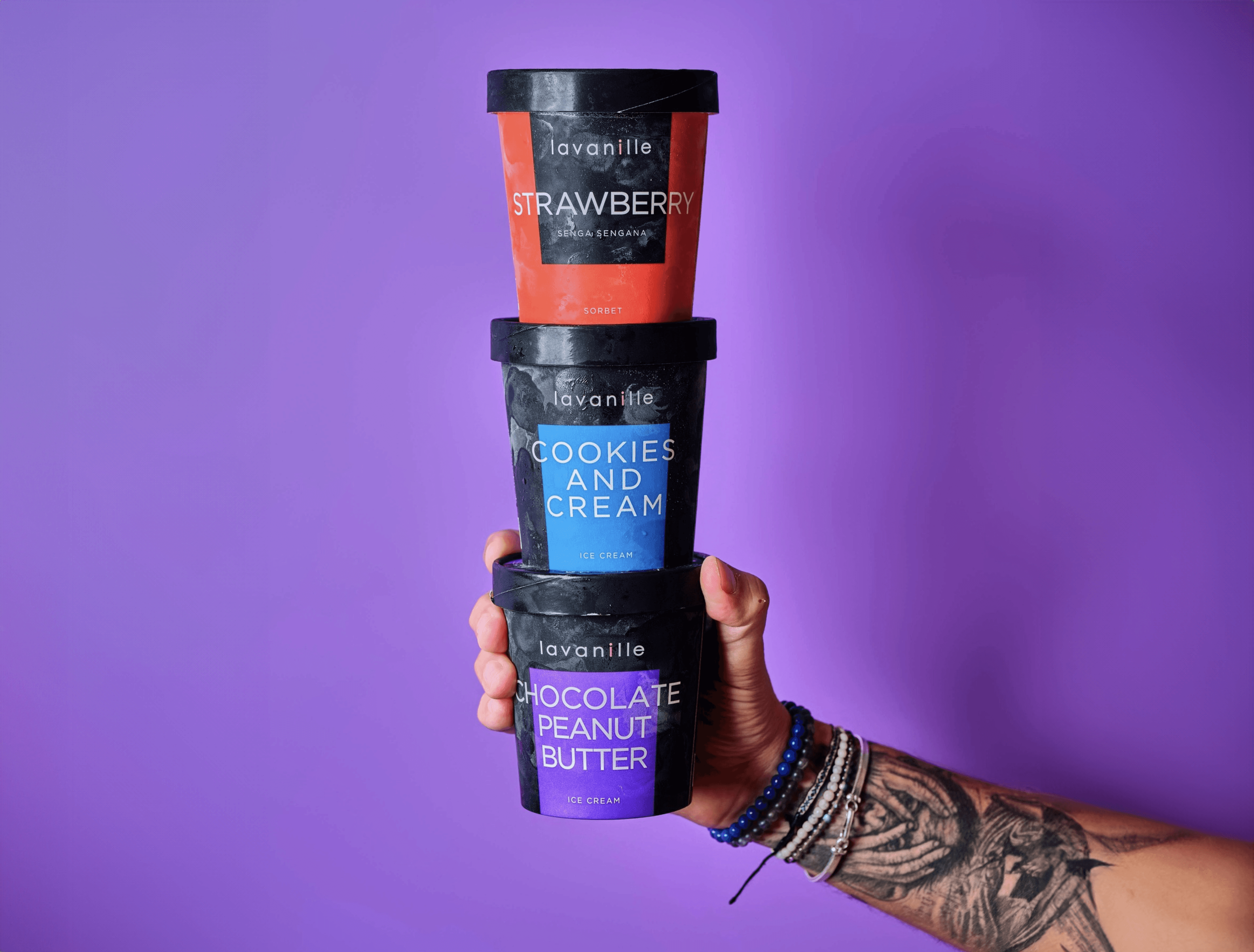
La Vanille has been creating ice cream and sorbet flavours since 2008, supplying restaurants, five-star hotels and now online. We have worked with them since 2020 across packaging, brochure and flyer design. For the packaging, the aim was to transmit the freshness you feel from a scoop of ice cream: colours were refined flavour by flavour, from vanilla brownie caramel to yuzu, so each pack is instantly identifiable and the range still works in harmony on the shelf.
Premium tea packaging design and brochure design
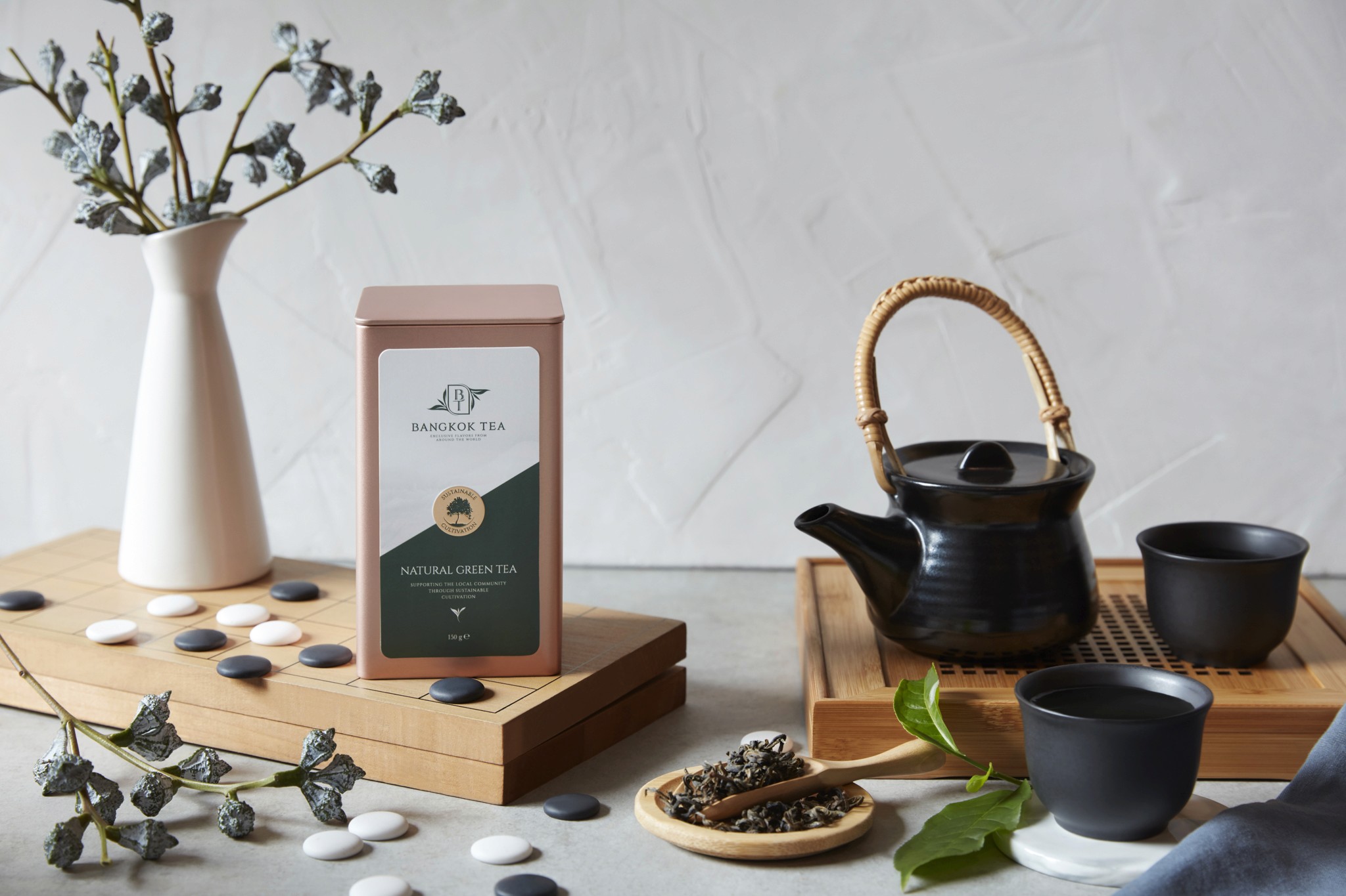
Bangkok Tea blends and packages premium organic teas, fusions, kombucha and tea-based spreads. We have built deep packaging knowledge in the food and beverage market, and worked closely with the client to develop a range that suits their innovative products. The aluminium container gave us scope for high-impact pack design: the logo stands out boldly, colours are powerful and luxurious, and packs are colour-coded for easy product identification. We also wrote the content on the back of each container.
Key visual and packaging design for snacks
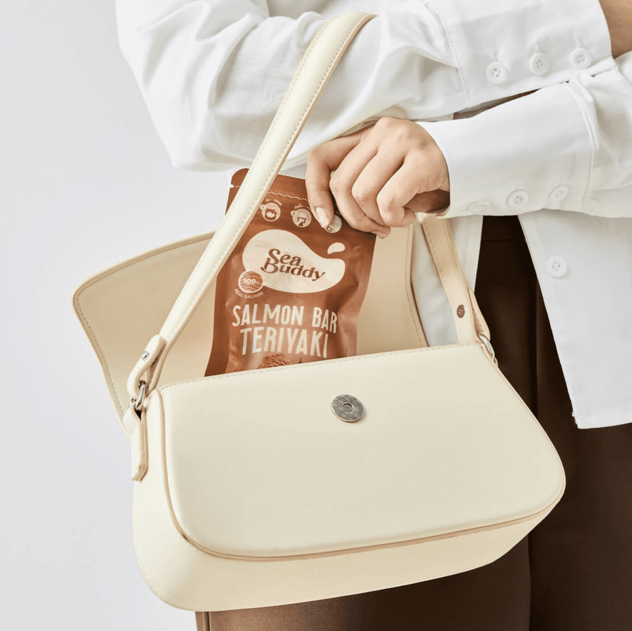
Sea Buddy makes ready-to-eat salmon snack bars for health-conscious consumers. After designing their new logo, our second task was to create the key visuals for packaging and marketing materials, crafting simple but striking imagery supported by careful photo retouching to lift product appeal. Once the key visual was approved, we integrated it into packaging for both box and sachet formats, adapted per flavour, including precision die-cut artwork. In total we delivered six unique packaging designs.
Can packaging design and key campaign visuals
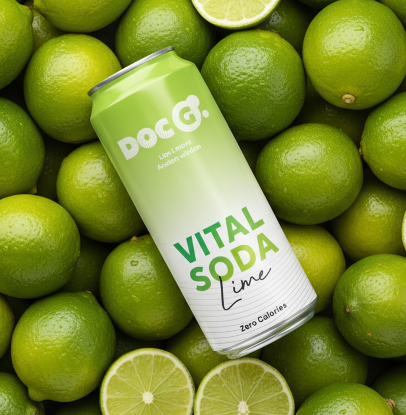
Doc G. is a Swiss functional soda blending Lion's Mane extracts with modern science, aimed at urban Swiss youth. We built the brand from scratch, then carried it into every printed and visual touchpoint. Packaging design, print collateral and the website ran in parallel to keep one consistent language, from the 330 ml slim can to digital. The can pairs bold typography with an energetic palette and clear flavour navigation across three lines: Mind Blow, Chill Out and Keep Going.
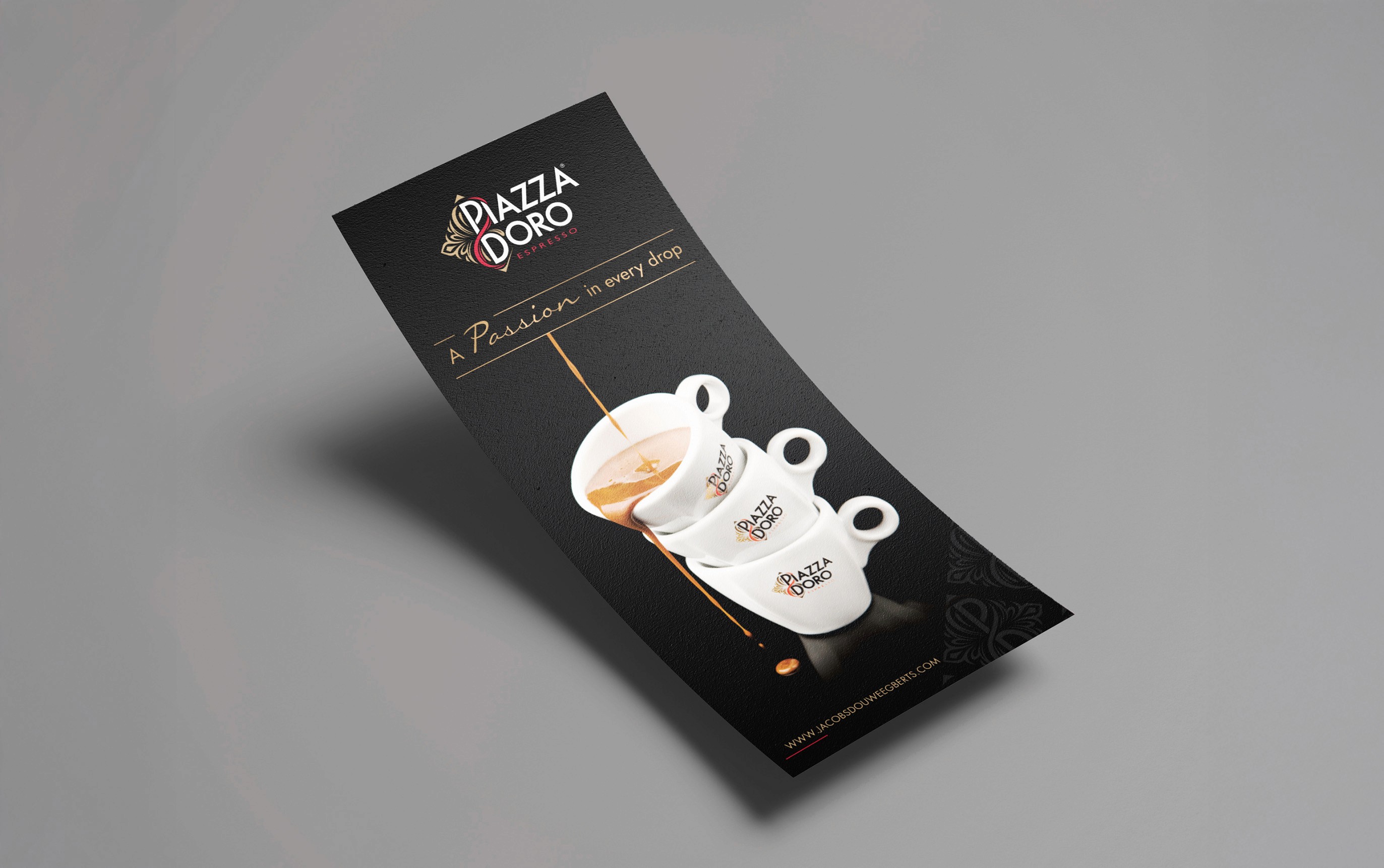
Print and marketing collateral for coffee brands
Jacobs Douwe Egberts is part of the largest pure-play coffee and tea company in the world, with Mocona, Pickwick, Douwe Egberts, L'OR and Piazza Doro in its Thailand portfolio. One of our original clients, JDE has worked with us for over a decade. That knowledge of the coffee market shapes a vast range of marketing collateral: brochures, flyers, infographics, menus and banners, plus visual support for each sub-brand and retail coffee kiosks designed for hotels, conferences and exhibitions.
Ice cream packaging design and print collateral
La Vanille has been creating ice cream and sorbet flavours since 2008, supplying restaurants, five-star hotels and now online. We have worked with them since 2020 across packaging, brochure and flyer design. For the packaging, the aim was to transmit the freshness you feel from a scoop of ice cream: colours were refined flavour by flavour, from vanilla brownie caramel to yuzu, so each pack is instantly identifiable and the range still works in harmony on the shelf.
Premium tea packaging design and brochure design
Bangkok Tea blends and packages premium organic teas, fusions, kombucha and tea-based spreads. We have built deep packaging knowledge in the food and beverage market, and worked closely with the client to develop a range that suits their innovative products. The aluminium container gave us scope for high-impact pack design: the logo stands out boldly, colours are powerful and luxurious, and packs are colour-coded for easy product identification. We also wrote the content on the back of each container.
Key visual and packaging design for snacks
Sea Buddy makes ready-to-eat salmon snack bars for health-conscious consumers. After designing their new logo, our second task was to create the key visuals for packaging and marketing materials, crafting simple but striking imagery supported by careful photo retouching to lift product appeal. Once the key visual was approved, we integrated it into packaging for both box and sachet formats, adapted per flavour, including precision die-cut artwork. In total we delivered six unique packaging designs.
Can packaging design and key campaign visuals
Doc G. is a Swiss functional soda blending Lion's Mane extracts with modern science, aimed at urban Swiss youth. We built the brand from scratch, then carried it into every printed and visual touchpoint. Packaging design, print collateral and the website ran in parallel to keep one consistent language, from the 330 ml slim can to digital. The can pairs bold typography with an energetic palette and clear flavour navigation across three lines: Mind Blow, Chill Out and Keep Going.
Print and marketing collateral for coffee brands
Jacobs Douwe Egberts is part of the largest pure-play coffee and tea company in the world, with Mocona, Pickwick, Douwe Egberts, L'OR and Piazza Doro in its Thailand portfolio. One of our original clients, JDE has worked with us for over a decade. That knowledge of the coffee market shapes a vast range of marketing collateral: brochures, flyers, infographics, menus and banners, plus visual support for each sub-brand and retail coffee kiosks designed for hotels, conferences and exhibitions.
Ice cream packaging design and print collateral
La Vanille has been creating ice cream and sorbet flavours since 2008, supplying restaurants, five-star hotels and now online. We have worked with them since 2020 across packaging, brochure and flyer design. For the packaging, the aim was to transmit the freshness you feel from a scoop of ice cream: colours were refined flavour by flavour, from vanilla brownie caramel to yuzu, so each pack is instantly identifiable and the range still works in harmony on the shelf.
Premium tea packaging design and brochure design
Bangkok Tea blends and packages premium organic teas, fusions, kombucha and tea-based spreads. We have built deep packaging knowledge in the food and beverage market, and worked closely with the client to develop a range that suits their innovative products. The aluminium container gave us scope for high-impact pack design: the logo stands out boldly, colours are powerful and luxurious, and packs are colour-coded for easy product identification. We also wrote the content on the back of each container.
Key visual and packaging design for snacks
Sea Buddy makes ready-to-eat salmon snack bars for health-conscious consumers. After designing their new logo, our second task was to create the key visuals for packaging and marketing materials, crafting simple but striking imagery supported by careful photo retouching to lift product appeal. Once the key visual was approved, we integrated it into packaging for both box and sachet formats, adapted per flavour, including precision die-cut artwork. In total we delivered six unique packaging designs.
Can packaging design and key campaign visuals
Doc G. is a Swiss functional soda blending Lion's Mane extracts with modern science, aimed at urban Swiss youth. We built the brand from scratch, then carried it into every printed and visual touchpoint. Packaging design, print collateral and the website ran in parallel to keep one consistent language, from the 330 ml slim can to digital. The can pairs bold typography with an energetic palette and clear flavour navigation across three lines: Mind Blow, Chill Out and Keep Going.
Print and marketing collateral for coffee brands
Jacobs Douwe Egberts is part of the largest pure-play coffee and tea company in the world, with Mocona, Pickwick, Douwe Egberts, L'OR and Piazza Doro in its Thailand portfolio. One of our original clients, JDE has worked with us for over a decade. That knowledge of the coffee market shapes a vast range of marketing collateral: brochures, flyers, infographics, menus and banners, plus visual support for each sub-brand and retail coffee kiosks designed for hotels, conferences and exhibitions.
Ice cream packaging design and print collateral
La Vanille has been creating ice cream and sorbet flavours since 2008, supplying restaurants, five-star hotels and now online. We have worked with them since 2020 across packaging, brochure and flyer design. For the packaging, the aim was to transmit the freshness you feel from a scoop of ice cream: colours were refined flavour by flavour, from vanilla brownie caramel to yuzu, so each pack is instantly identifiable and the range still works in harmony on the shelf.
Premium tea packaging design and brochure design
Bangkok Tea blends and packages premium organic teas, fusions, kombucha and tea-based spreads. We have built deep packaging knowledge in the food and beverage market, and worked closely with the client to develop a range that suits their innovative products. The aluminium container gave us scope for high-impact pack design: the logo stands out boldly, colours are powerful and luxurious, and packs are colour-coded for easy product identification. We also wrote the content on the back of each container.
Key visual and packaging design for snacks
Sea Buddy makes ready-to-eat salmon snack bars for health-conscious consumers. After designing their new logo, our second task was to create the key visuals for packaging and marketing materials, crafting simple but striking imagery supported by careful photo retouching to lift product appeal. Once the key visual was approved, we integrated it into packaging for both box and sachet formats, adapted per flavour, including precision die-cut artwork. In total we delivered six unique packaging designs.
Can packaging design and key campaign visuals
Doc G. is a Swiss functional soda blending Lion's Mane extracts with modern science, aimed at urban Swiss youth. We built the brand from scratch, then carried it into every printed and visual touchpoint. Packaging design, print collateral and the website ran in parallel to keep one consistent language, from the 330 ml slim can to digital. The can pairs bold typography with an energetic palette and clear flavour navigation across three lines: Mind Blow, Chill Out and Keep Going.
Print and marketing collateral for coffee brands
Jacobs Douwe Egberts is part of the largest pure-play coffee and tea company in the world, with Mocona, Pickwick, Douwe Egberts, L'OR and Piazza Doro in its Thailand portfolio. One of our original clients, JDE has worked with us for over a decade. That knowledge of the coffee market shapes a vast range of marketing collateral: brochures, flyers, infographics, menus and banners, plus visual support for each sub-brand and retail coffee kiosks designed for hotels, conferences and exhibitions.
Ice cream packaging design and print collateral
La Vanille has been creating ice cream and sorbet flavours since 2008, supplying restaurants, five-star hotels and now online. We have worked with them since 2020 across packaging, brochure and flyer design. For the packaging, the aim was to transmit the freshness you feel from a scoop of ice cream: colours were refined flavour by flavour, from vanilla brownie caramel to yuzu, so each pack is instantly identifiable and the range still works in harmony on the shelf.
Premium tea packaging design and brochure design
Bangkok Tea blends and packages premium organic teas, fusions, kombucha and tea-based spreads. We have built deep packaging knowledge in the food and beverage market, and worked closely with the client to develop a range that suits their innovative products. The aluminium container gave us scope for high-impact pack design: the logo stands out boldly, colours are powerful and luxurious, and packs are colour-coded for easy product identification. We also wrote the content on the back of each container.
Key visual and packaging design for snacks
Sea Buddy makes ready-to-eat salmon snack bars for health-conscious consumers. After designing their new logo, our second task was to create the key visuals for packaging and marketing materials, crafting simple but striking imagery supported by careful photo retouching to lift product appeal. Once the key visual was approved, we integrated it into packaging for both box and sachet formats, adapted per flavour, including precision die-cut artwork. In total we delivered six unique packaging designs.
Can packaging design and key campaign visuals
Doc G. is a Swiss functional soda blending Lion's Mane extracts with modern science, aimed at urban Swiss youth. We built the brand from scratch, then carried it into every printed and visual touchpoint. Packaging design, print collateral and the website ran in parallel to keep one consistent language, from the 330 ml slim can to digital. The can pairs bold typography with an energetic palette and clear flavour navigation across three lines: Mind Blow, Chill Out and Keep Going.
Print and marketing collateral for coffee brands
Jacobs Douwe Egberts is part of the largest pure-play coffee and tea company in the world, with Mocona, Pickwick, Douwe Egberts, L'OR and Piazza Doro in its Thailand portfolio. One of our original clients, JDE has worked with us for over a decade. That knowledge of the coffee market shapes a vast range of marketing collateral: brochures, flyers, infographics, menus and banners, plus visual support for each sub-brand and retail coffee kiosks designed for hotels, conferences and exhibitions.
Ice cream packaging design and print collateral
La Vanille has been creating ice cream and sorbet flavours since 2008, supplying restaurants, five-star hotels and now online. We have worked with them since 2020 across packaging, brochure and flyer design. For the packaging, the aim was to transmit the freshness you feel from a scoop of ice cream: colours were refined flavour by flavour, from vanilla brownie caramel to yuzu, so each pack is instantly identifiable and the range still works in harmony on the shelf.
Premium tea packaging design and brochure design
Bangkok Tea blends and packages premium organic teas, fusions, kombucha and tea-based spreads. We have built deep packaging knowledge in the food and beverage market, and worked closely with the client to develop a range that suits their innovative products. The aluminium container gave us scope for high-impact pack design: the logo stands out boldly, colours are powerful and luxurious, and packs are colour-coded for easy product identification. We also wrote the content on the back of each container.
Key visual and packaging design for snacks
Sea Buddy makes ready-to-eat salmon snack bars for health-conscious consumers. After designing their new logo, our second task was to create the key visuals for packaging and marketing materials, crafting simple but striking imagery supported by careful photo retouching to lift product appeal. Once the key visual was approved, we integrated it into packaging for both box and sachet formats, adapted per flavour, including precision die-cut artwork. In total we delivered six unique packaging designs.
Can packaging design and key campaign visuals
Doc G. is a Swiss functional soda blending Lion's Mane extracts with modern science, aimed at urban Swiss youth. We built the brand from scratch, then carried it into every printed and visual touchpoint. Packaging design, print collateral and the website ran in parallel to keep one consistent language, from the 330 ml slim can to digital. The can pairs bold typography with an energetic palette and clear flavour navigation across three lines: Mind Blow, Chill Out and Keep Going.
Print and marketing collateral for coffee brands
Jacobs Douwe Egberts is part of the largest pure-play coffee and tea company in the world, with Mocona, Pickwick, Douwe Egberts, L'OR and Piazza Doro in its Thailand portfolio. One of our original clients, JDE has worked with us for over a decade. That knowledge of the coffee market shapes a vast range of marketing collateral: brochures, flyers, infographics, menus and banners, plus visual support for each sub-brand and retail coffee kiosks designed for hotels, conferences and exhibitions.
Ice cream packaging design and print collateral
La Vanille has been creating ice cream and sorbet flavours since 2008, supplying restaurants, five-star hotels and now online. We have worked with them since 2020 across packaging, brochure and flyer design. For the packaging, the aim was to transmit the freshness you feel from a scoop of ice cream: colours were refined flavour by flavour, from vanilla brownie caramel to yuzu, so each pack is instantly identifiable and the range still works in harmony on the shelf.
Premium tea packaging design and brochure design
Bangkok Tea blends and packages premium organic teas, fusions, kombucha and tea-based spreads. We have built deep packaging knowledge in the food and beverage market, and worked closely with the client to develop a range that suits their innovative products. The aluminium container gave us scope for high-impact pack design: the logo stands out boldly, colours are powerful and luxurious, and packs are colour-coded for easy product identification. We also wrote the content on the back of each container.
Key visual and packaging design for snacks
Sea Buddy makes ready-to-eat salmon snack bars for health-conscious consumers. After designing their new logo, our second task was to create the key visuals for packaging and marketing materials, crafting simple but striking imagery supported by careful photo retouching to lift product appeal. Once the key visual was approved, we integrated it into packaging for both box and sachet formats, adapted per flavour, including precision die-cut artwork. In total we delivered six unique packaging designs.
Can packaging design and key campaign visuals
Doc G. is a Swiss functional soda blending Lion's Mane extracts with modern science, aimed at urban Swiss youth. We built the brand from scratch, then carried it into every printed and visual touchpoint. Packaging design, print collateral and the website ran in parallel to keep one consistent language, from the 330 ml slim can to digital. The can pairs bold typography with an energetic palette and clear flavour navigation across three lines: Mind Blow, Chill Out and Keep Going.
Print and marketing collateral for coffee brands
Jacobs Douwe Egberts is part of the largest pure-play coffee and tea company in the world, with Mocona, Pickwick, Douwe Egberts, L'OR and Piazza Doro in its Thailand portfolio. One of our original clients, JDE has worked with us for over a decade. That knowledge of the coffee market shapes a vast range of marketing collateral: brochures, flyers, infographics, menus and banners, plus visual support for each sub-brand and retail coffee kiosks designed for hotels, conferences and exhibitions.
Ice cream packaging design and print collateral
La Vanille has been creating ice cream and sorbet flavours since 2008, supplying restaurants, five-star hotels and now online. We have worked with them since 2020 across packaging, brochure and flyer design. For the packaging, the aim was to transmit the freshness you feel from a scoop of ice cream: colours were refined flavour by flavour, from vanilla brownie caramel to yuzu, so each pack is instantly identifiable and the range still works in harmony on the shelf.
Premium tea packaging design and brochure design
Bangkok Tea blends and packages premium organic teas, fusions, kombucha and tea-based spreads. We have built deep packaging knowledge in the food and beverage market, and worked closely with the client to develop a range that suits their innovative products. The aluminium container gave us scope for high-impact pack design: the logo stands out boldly, colours are powerful and luxurious, and packs are colour-coded for easy product identification. We also wrote the content on the back of each container.
Key visual and packaging design for snacks
Sea Buddy makes ready-to-eat salmon snack bars for health-conscious consumers. After designing their new logo, our second task was to create the key visuals for packaging and marketing materials, crafting simple but striking imagery supported by careful photo retouching to lift product appeal. Once the key visual was approved, we integrated it into packaging for both box and sachet formats, adapted per flavour, including precision die-cut artwork. In total we delivered six unique packaging designs.
Can packaging design and key campaign visuals
Doc G. is a Swiss functional soda blending Lion's Mane extracts with modern science, aimed at urban Swiss youth. We built the brand from scratch, then carried it into every printed and visual touchpoint. Packaging design, print collateral and the website ran in parallel to keep one consistent language, from the 330 ml slim can to digital. The can pairs bold typography with an energetic palette and clear flavour navigation across three lines: Mind Blow, Chill Out and Keep Going.
Print and marketing collateral for coffee brands
Jacobs Douwe Egberts is part of the largest pure-play coffee and tea company in the world, with Mocona, Pickwick, Douwe Egberts, L'OR and Piazza Doro in its Thailand portfolio. One of our original clients, JDE has worked with us for over a decade. That knowledge of the coffee market shapes a vast range of marketing collateral: brochures, flyers, infographics, menus and banners, plus visual support for each sub-brand and retail coffee kiosks designed for hotels, conferences and exhibitions.
Why communication design matters?
A brand is only as strong as the last thing someone saw it on. Packaging is often the only sales pitch a product gets, a brochure is what stays behind after the meeting ends, and an ad has seconds to land an idea. Made carelessly, they undo the work the brand identity was supposed to do.
A brand is only as strong as the last thing someone saw it on. Packaging is often the only sales pitch a product gets, a brochure is what stays behind after the meeting ends, and an ad has seconds to land an idea. Made carelessly, they undo the work the brand identity was supposed to do.
Getting them right takes more than good layout. It takes knowing how ink behaves on stock, how a pack reads at arm’s length on a shelf, and how a message survives being shrunk to a banner. That production knowledge is what we bring alongside the design.
Process.
Process.
Process.
A structured process keeps every piece on brand, on schedule, and ready for production.
Briefing & Discovery
We start by defining objectives, audience, and deliverables, so everyone agrees on what the work has to achieve before any design begins.
Content & Research
We gather and organize your copy, images, and brand materials, and study the market and competitors to find the angle worth taking.
Structure & Planning
We map sections, hierarchy, and content flow, and for packaging the dielines and keylines, creating a framework that supports both clarity and production reality.
Key Concepts
We design the cover, the key visual, or the lead pages that set the creative direction, establishing tone, typography, and visual balance before the full rollout.
Full Development
Once the direction is approved, we apply the system across every page, variant, and format, keeping composition and visual rhythm consistent throughout.
Review & Refinement
We review the work with you and refine details for alignment, accuracy, and consistency, until the layout is polished and ready for production.
Delivery & Production
You receive editable and print-ready files. If you want, we manage the printing directly, controlling color accuracy and finishing through to the final run.
FAQ.
FAQ.
FAQ.
Find answers to the most common questions clients ask about our communication design services.

Communication design is how your brand shows up in the real world once the identity exists. It covers campaign key visuals, brochures, corporate profiles, presentations, packaging, signage and event graphics. Branding sets the rules, communication design puts them to work for a specific audience and a specific moment.
Campaign key visuals, brochures and company profiles, annual reports, product catalogues, POS and retail materials, exhibition and booth graphics, signage and wayfinding, pitch decks and presentation templates, and social media asset kits.
A key visual is the single anchor image and layout that carries a campaign across every channel, from a billboard to an Instagram story to a booth backdrop. Without one, each channel drifts and the campaign stops feeling like a campaign.
Not necessarily. We can source visuals from premium stock libraries and licensed image banks, which keeps budgets and timelines tight. When a project needs something specific we shoot it ourselves, since AMS is also a photo and video production studio. Many projects use a smart mix of both, and we will recommend what makes sense for your budget.
Absolutely. A large part of our communication design work is executing within a brand book set by a client or a global head office. We respect the system and find the creative room inside it.
Yes. We prepare print-ready artwork with correct bleeds, colour profiles and specifications, and we can manage the printer relationship, proofing and quality control. We have long-standing production partners in Bangkok, so nothing gets lost between design and press.
Yes. Packaging design, label design, dieline preparation and print-ready artwork, including the label requirements for the Thai market. We can also arrange mockups and product photography so you see the pack before it goes to production.
Yes. Booth graphics, backdrops, roll-ups, wayfinding, stage elements and event collateral. Large-format work needs its own approach to scale and legibility, and we design for how people will actually see it, not how it looks on a screen.
Yes. AMS is a full production studio, so a key visual can extend into motion graphics, animated social cuts, video content and screen displays. Designing the static and the motion together keeps everything consistent and usually costs less than doing them separately.
Typically 2 to 4 weeks for the master key visual and its main adaptations, depending on how many formats and channels are needed. Once the master is approved, additional sizes and adaptations come quickly.
Communication design is how your brand shows up in the real world once the identity exists. It covers campaign key visuals, brochures, corporate profiles, presentations, packaging, signage and event graphics. Branding sets the rules, communication design puts them to work for a specific audience and a specific moment.
Campaign key visuals, brochures and company profiles, annual reports, product catalogues, POS and retail materials, exhibition and booth graphics, signage and wayfinding, pitch decks and presentation templates, and social media asset kits.
A key visual is the single anchor image and layout that carries a campaign across every channel, from a billboard to an Instagram story to a booth backdrop. Without one, each channel drifts and the campaign stops feeling like a campaign.
Not necessarily. We can source visuals from premium stock libraries and licensed image banks, which keeps budgets and timelines tight. When a project needs something specific we shoot it ourselves, since AMS is also a photo and video production studio. Many projects use a smart mix of both, and we will recommend what makes sense for your budget.
Absolutely. A large part of our communication design work is executing within a brand book set by a client or a global head office. We respect the system and find the creative room inside it.
Yes. We prepare print-ready artwork with correct bleeds, colour profiles and specifications, and we can manage the printer relationship, proofing and quality control. We have long-standing production partners in Bangkok, so nothing gets lost between design and press.
Yes. Packaging design, label design, dieline preparation and print-ready artwork, including the label requirements for the Thai market. We can also arrange mockups and product photography so you see the pack before it goes to production.
Yes. Booth graphics, backdrops, roll-ups, wayfinding, stage elements and event collateral. Large-format work needs its own approach to scale and legibility, and we design for how people will actually see it, not how it looks on a screen.
Yes. AMS is a full production studio, so a key visual can extend into motion graphics, animated social cuts, video content and screen displays. Designing the static and the motion together keeps everything consistent and usually costs less than doing them separately.
Typically 2 to 4 weeks for the master key visual and its main adaptations, depending on how many formats and channels are needed. Once the master is approved, additional sizes and adaptations come quickly.
Communication design is how your brand shows up in the real world once the identity exists. It covers campaign key visuals, brochures, corporate profiles, presentations, packaging, signage and event graphics. Branding sets the rules, communication design puts them to work for a specific audience and a specific moment.
Campaign key visuals, brochures and company profiles, annual reports, product catalogues, POS and retail materials, exhibition and booth graphics, signage and wayfinding, pitch decks and presentation templates, and social media asset kits.
A key visual is the single anchor image and layout that carries a campaign across every channel, from a billboard to an Instagram story to a booth backdrop. Without one, each channel drifts and the campaign stops feeling like a campaign.
Not necessarily. We can source visuals from premium stock libraries and licensed image banks, which keeps budgets and timelines tight. When a project needs something specific we shoot it ourselves, since AMS is also a photo and video production studio. Many projects use a smart mix of both, and we will recommend what makes sense for your budget.
Absolutely. A large part of our communication design work is executing within a brand book set by a client or a global head office. We respect the system and find the creative room inside it.
Yes. We prepare print-ready artwork with correct bleeds, colour profiles and specifications, and we can manage the printer relationship, proofing and quality control. We have long-standing production partners in Bangkok, so nothing gets lost between design and press.
Yes. Packaging design, label design, dieline preparation and print-ready artwork, including the label requirements for the Thai market. We can also arrange mockups and product photography so you see the pack before it goes to production.
Yes. Booth graphics, backdrops, roll-ups, wayfinding, stage elements and event collateral. Large-format work needs its own approach to scale and legibility, and we design for how people will actually see it, not how it looks on a screen.
Yes. AMS is a full production studio, so a key visual can extend into motion graphics, animated social cuts, video content and screen displays. Designing the static and the motion together keeps everything consistent and usually costs less than doing them separately.
Typically 2 to 4 weeks for the master key visual and its main adaptations, depending on how many formats and channels are needed. Once the master is approved, additional sizes and adaptations come quickly.
Let’s talk.
Whether you need branding, a new website, or digital marketing, our team collaborates with you to turn ideas into results that connect and create lasting impact.
Quick response.
Prompt and collaborative, we ensure a clear understanding of your project.
Clear next steps.
Following consultation, you’ll receive a clear proposal with timeline.
Let’s talk.
Whether you need branding, a new website, or digital marketing, our team collaborates with you to turn ideas into results that connect and create lasting impact.
Quick response.
Prompt and collaborative, we ensure a clear understanding of your project.
Clear next steps.
Following consultation, you’ll receive a clear proposal with timeline.
Let’s talk.
Whether you need branding, a new website, or digital marketing, our team collaborates with you to turn ideas into results that connect and create lasting impact.
Quick response.
Prompt and collaborative, we ensure a clear understanding of your project.
Clear next steps.
Following consultation, you’ll receive a clear proposal with timeline.