
Design de communication
Design de communication
Design de communication à Bangkok, Thaïlande
Nous transformons votre marque en éléments que les gens touchent, lisent et voient concrètement : brochures, emballages et campagnes.
Nous prenons en charge le côté appliqué du design, là où une marque cesse d'être un document de directives pour commencer à s'incarner dans le monde réel. Des brochures d'entreprise et catalogues de produits aux emballages de vente au détail et campagnes publicitaires, nous associons l'art de la mise en page, la photographie et la gestion de production pour livrer un travail fidèle à la marque, prêt pour l'impression et conçu pour être performant aussi bien en rayon que sur papier.
Des grands noms mondiaux aux favoris locaux, voici quelques-unes des marques pour lesquelles nous concevons des supports imprimés et publicitaires.








Services de communication.
Services de communication.
Conception de brochure
Conception de brochure
Des imprimés qui ont du poids. Nous concevons des brochures d'entreprise, des catalogues de produits et des documents de vente avec une structure claire, une typographie raffinée et un récit qui renforce la crédibilité. Nous pouvons rédiger et éditer le contenu, organiser les prises de vues photographiques et gérer l'impression jusqu'à la livraison.
Brochures d'entreprise
Catalogues de produits
Supports marketing
Brochures numériques
Photographie & rédaction
Production d'impression


Conception d'emballage
Conception d'emballage
L'emballage doit s'imposer sur un rayon bondé et survivre à une phase de production. Nous développons un concept visuel clé qui domine sa catégorie, nous le validons par des rendus 3D avant toute impression, et nous l'adaptons proprement à chaque parfum, variante et format d'emballage. Les fichiers sont livrés prêts pour l'impression et vérifiés selon les spécifications de votre fabricant.
Conception visuelle clé
Visualisation 3D et maquettes
Adaptation des variantes et des tailles
Photographie de produits
Tracés de découpe et fichiers prêts à l'impression
Gestion de la production
Conception publicitaire
Conception publicitaire
Des campagnes construites autour d'une idée forte qui voyage. Nous développons le visuel clé et le message, puis nous les adaptons sur les supports imprimés, extérieurs et numériques afin que la campagne reste reconnaissable, qu'elle apparaisse sur un panneau d'affichage ou une bannière. La photographie, la direction artistique et le travail final de création graphique sont gérés en interne.
Développement de l'identité visuelle clé
Impression & affichage
Ressources numériques et sociales
Conception-rédaction de campagne
Photographie et direction artistique
Création artistique et production

Nos réalisations
Un aperçu des brochures, des emballages et des campagnes que nous avons réalisés dans différents secteurs d'activité.

Ice cream packaging design and print collateral
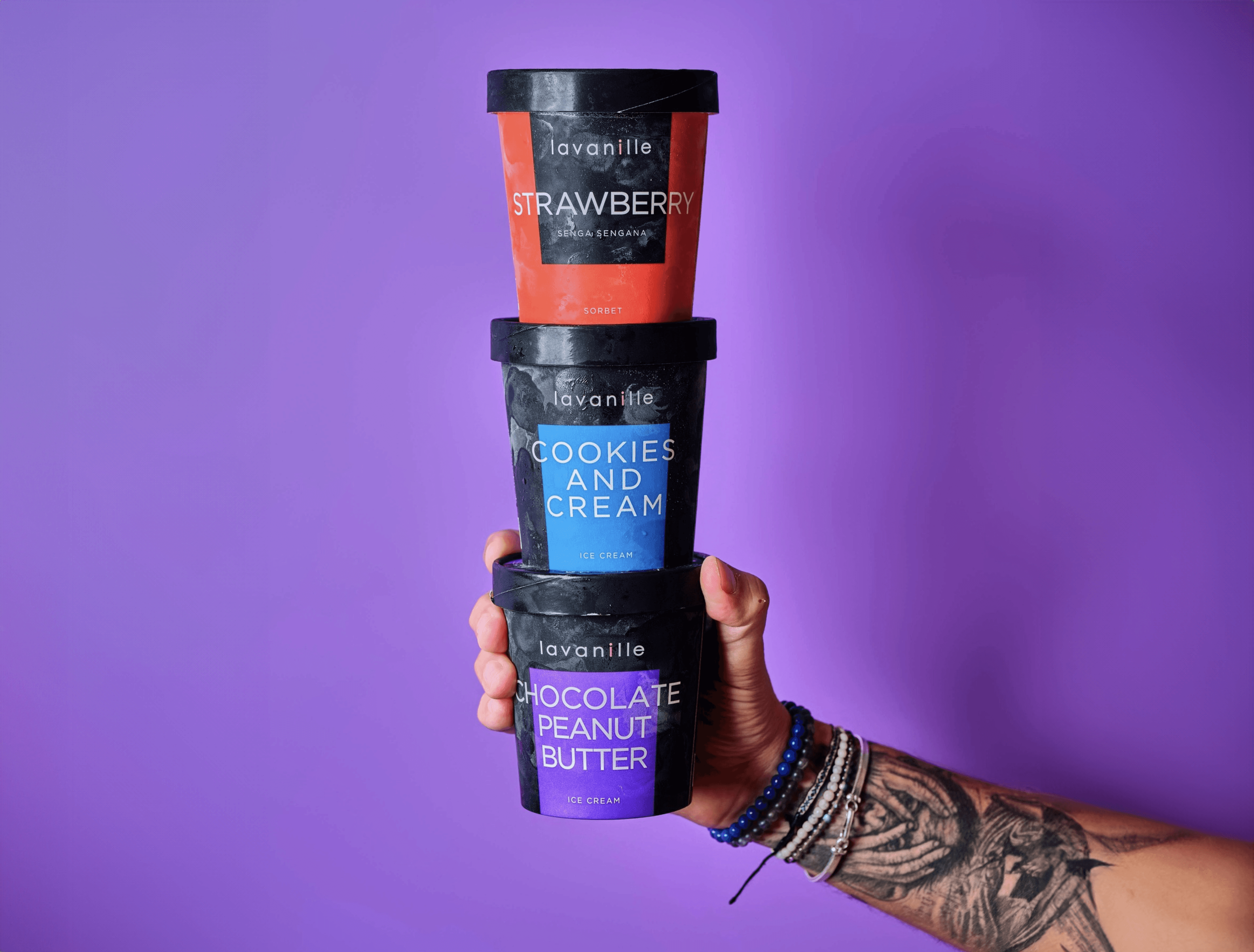
La Vanille has been creating ice cream and sorbet flavours since 2008, supplying restaurants, five-star hotels and now online. We have worked with them since 2020 across packaging, brochure and flyer design. For the packaging, the aim was to transmit the freshness you feel from a scoop of ice cream: colours were refined flavour by flavour, from vanilla brownie caramel to yuzu, so each pack is instantly identifiable and the range still works in harmony on the shelf.
Premium tea packaging design and brochure design
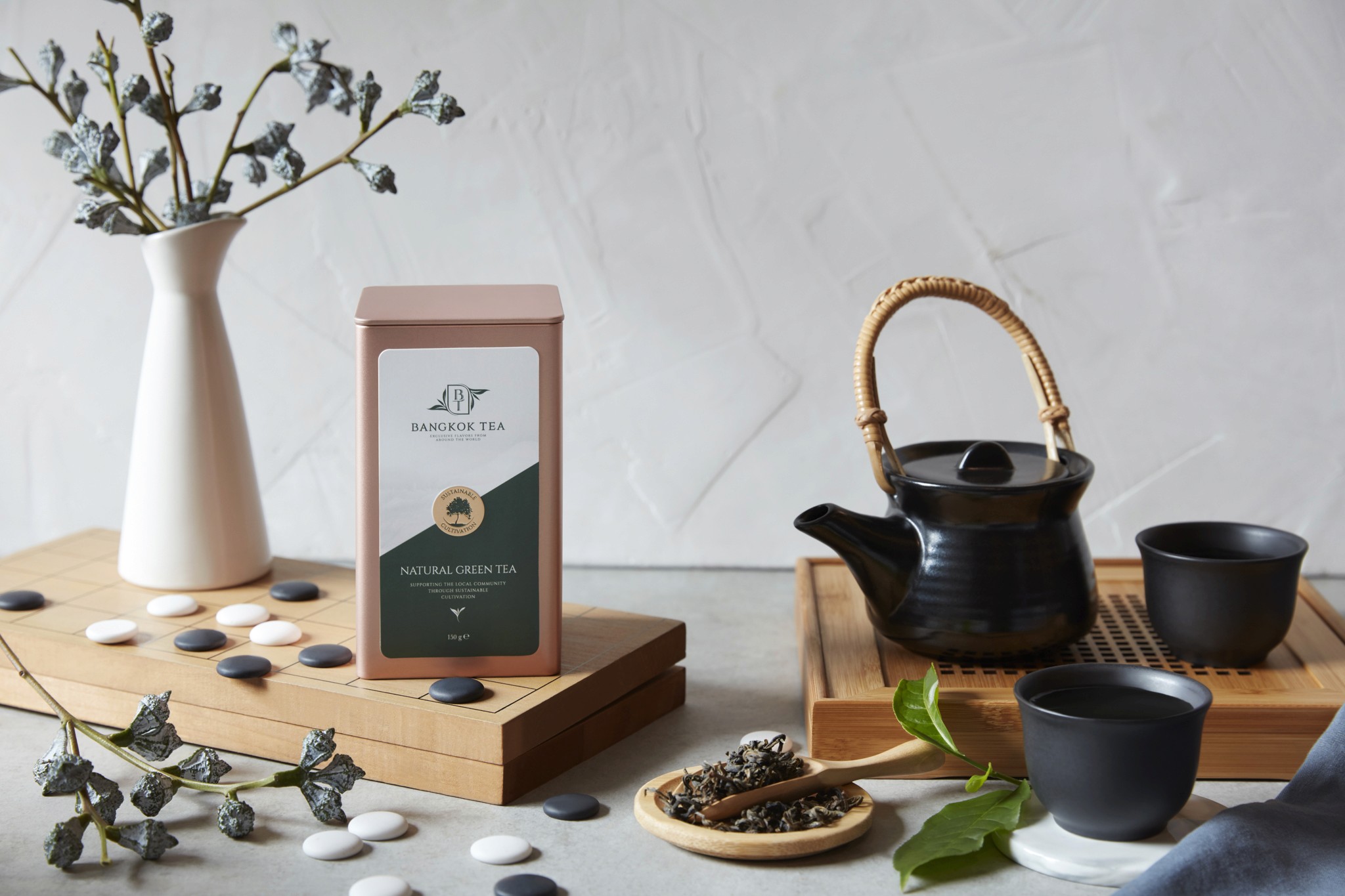
Bangkok Tea blends and packages premium organic teas, fusions, kombucha and tea-based spreads. We have built deep packaging knowledge in the food and beverage market, and worked closely with the client to develop a range that suits their innovative products. The aluminium container gave us scope for high-impact pack design: the logo stands out boldly, colours are powerful and luxurious, and packs are colour-coded for easy product identification. We also wrote the content on the back of each container.
Key visual and packaging design for snacks
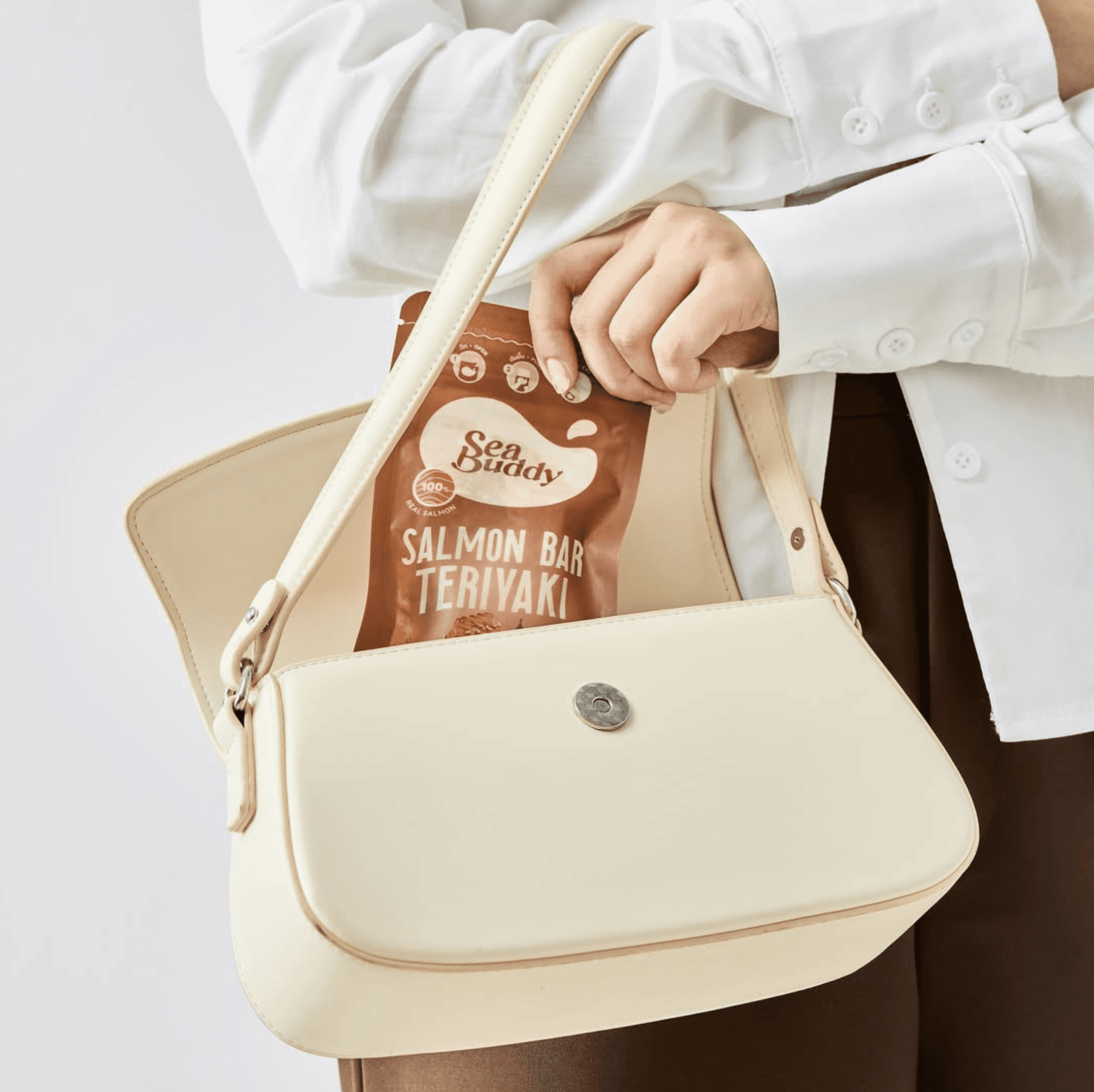
Sea Buddy makes ready-to-eat salmon snack bars for health-conscious consumers. After designing their new logo, our second task was to create the key visuals for packaging and marketing materials, crafting simple but striking imagery supported by careful photo retouching to lift product appeal. Once the key visual was approved, we integrated it into packaging for both box and sachet formats, adapted per flavour, including precision die-cut artwork. In total we delivered six unique packaging designs.
Can packaging design and key campaign visuals
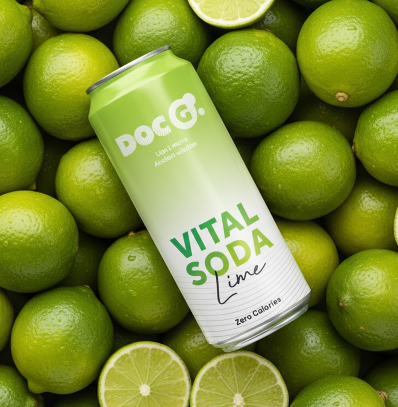
Doc G. is a Swiss functional soda blending Lion's Mane extracts with modern science, aimed at urban Swiss youth. We built the brand from scratch, then carried it into every printed and visual touchpoint. Packaging design, print collateral and the website ran in parallel to keep one consistent language, from the 330 ml slim can to digital. The can pairs bold typography with an energetic palette and clear flavour navigation across three lines: Mind Blow, Chill Out and Keep Going.
Print and marketing collateral for coffee brands
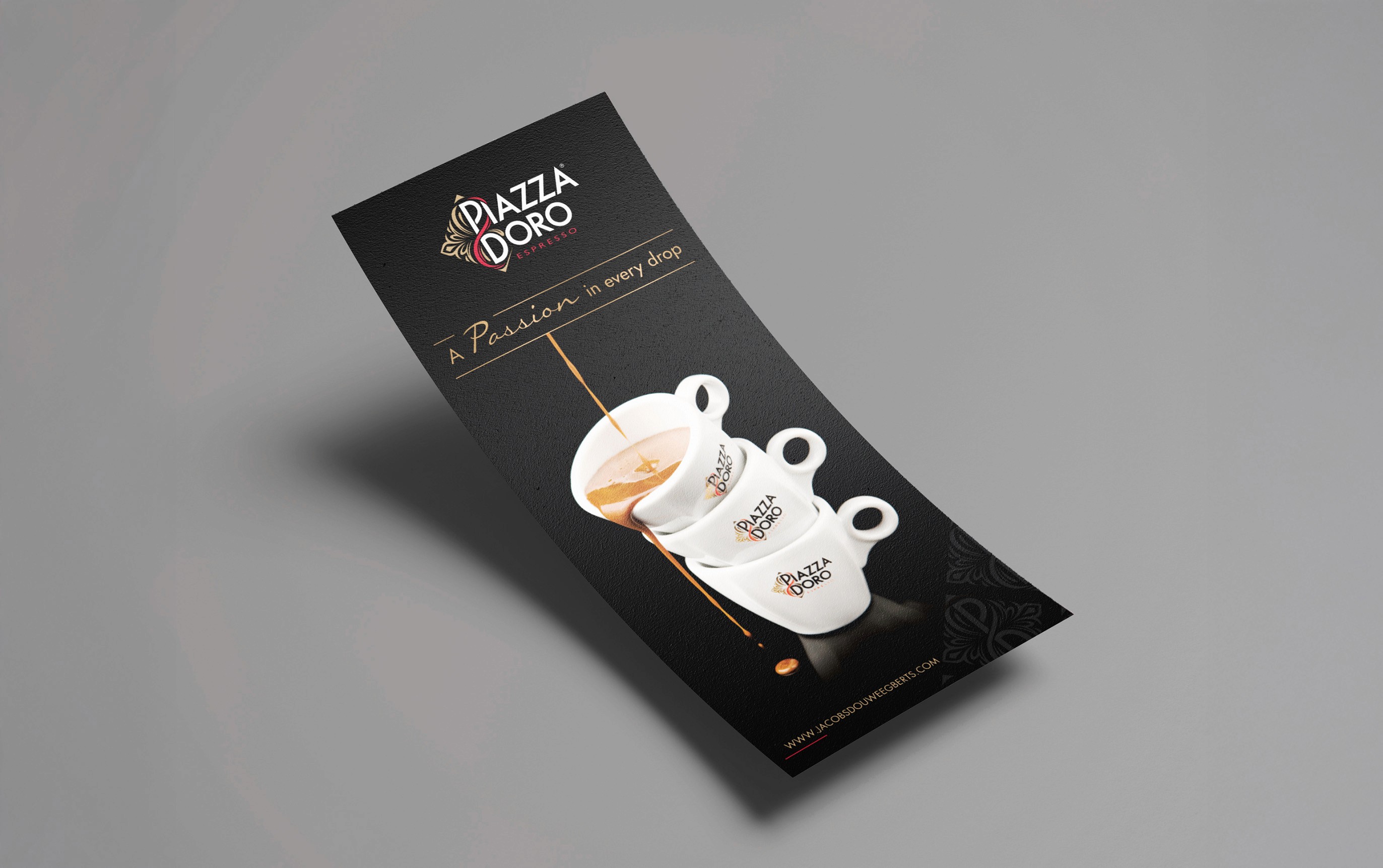
Jacobs Douwe Egberts is part of the largest pure-play coffee and tea company in the world, with Mocona, Pickwick, Douwe Egberts, L'OR and Piazza Doro in its Thailand portfolio. One of our original clients, JDE has worked with us for over a decade. That knowledge of the coffee market shapes a vast range of marketing collateral: brochures, flyers, infographics, menus and banners, plus visual support for each sub-brand and retail coffee kiosks designed for hotels, conferences and exhibitions.
Ice cream packaging design and print collateral
La Vanille has been creating ice cream and sorbet flavours since 2008, supplying restaurants, five-star hotels and now online. We have worked with them since 2020 across packaging, brochure and flyer design. For the packaging, the aim was to transmit the freshness you feel from a scoop of ice cream: colours were refined flavour by flavour, from vanilla brownie caramel to yuzu, so each pack is instantly identifiable and the range still works in harmony on the shelf.
Premium tea packaging design and brochure design
Bangkok Tea blends and packages premium organic teas, fusions, kombucha and tea-based spreads. We have built deep packaging knowledge in the food and beverage market, and worked closely with the client to develop a range that suits their innovative products. The aluminium container gave us scope for high-impact pack design: the logo stands out boldly, colours are powerful and luxurious, and packs are colour-coded for easy product identification. We also wrote the content on the back of each container.
Key visual and packaging design for snacks
Sea Buddy makes ready-to-eat salmon snack bars for health-conscious consumers. After designing their new logo, our second task was to create the key visuals for packaging and marketing materials, crafting simple but striking imagery supported by careful photo retouching to lift product appeal. Once the key visual was approved, we integrated it into packaging for both box and sachet formats, adapted per flavour, including precision die-cut artwork. In total we delivered six unique packaging designs.
Can packaging design and key campaign visuals
Doc G. is a Swiss functional soda blending Lion's Mane extracts with modern science, aimed at urban Swiss youth. We built the brand from scratch, then carried it into every printed and visual touchpoint. Packaging design, print collateral and the website ran in parallel to keep one consistent language, from the 330 ml slim can to digital. The can pairs bold typography with an energetic palette and clear flavour navigation across three lines: Mind Blow, Chill Out and Keep Going.
Print and marketing collateral for coffee brands
Jacobs Douwe Egberts is part of the largest pure-play coffee and tea company in the world, with Mocona, Pickwick, Douwe Egberts, L'OR and Piazza Doro in its Thailand portfolio. One of our original clients, JDE has worked with us for over a decade. That knowledge of the coffee market shapes a vast range of marketing collateral: brochures, flyers, infographics, menus and banners, plus visual support for each sub-brand and retail coffee kiosks designed for hotels, conferences and exhibitions.
Ice cream packaging design and print collateral
La Vanille has been creating ice cream and sorbet flavours since 2008, supplying restaurants, five-star hotels and now online. We have worked with them since 2020 across packaging, brochure and flyer design. For the packaging, the aim was to transmit the freshness you feel from a scoop of ice cream: colours were refined flavour by flavour, from vanilla brownie caramel to yuzu, so each pack is instantly identifiable and the range still works in harmony on the shelf.
Premium tea packaging design and brochure design
Bangkok Tea blends and packages premium organic teas, fusions, kombucha and tea-based spreads. We have built deep packaging knowledge in the food and beverage market, and worked closely with the client to develop a range that suits their innovative products. The aluminium container gave us scope for high-impact pack design: the logo stands out boldly, colours are powerful and luxurious, and packs are colour-coded for easy product identification. We also wrote the content on the back of each container.
Key visual and packaging design for snacks
Sea Buddy makes ready-to-eat salmon snack bars for health-conscious consumers. After designing their new logo, our second task was to create the key visuals for packaging and marketing materials, crafting simple but striking imagery supported by careful photo retouching to lift product appeal. Once the key visual was approved, we integrated it into packaging for both box and sachet formats, adapted per flavour, including precision die-cut artwork. In total we delivered six unique packaging designs.
Can packaging design and key campaign visuals
Doc G. is a Swiss functional soda blending Lion's Mane extracts with modern science, aimed at urban Swiss youth. We built the brand from scratch, then carried it into every printed and visual touchpoint. Packaging design, print collateral and the website ran in parallel to keep one consistent language, from the 330 ml slim can to digital. The can pairs bold typography with an energetic palette and clear flavour navigation across three lines: Mind Blow, Chill Out and Keep Going.
Print and marketing collateral for coffee brands
Jacobs Douwe Egberts is part of the largest pure-play coffee and tea company in the world, with Mocona, Pickwick, Douwe Egberts, L'OR and Piazza Doro in its Thailand portfolio. One of our original clients, JDE has worked with us for over a decade. That knowledge of the coffee market shapes a vast range of marketing collateral: brochures, flyers, infographics, menus and banners, plus visual support for each sub-brand and retail coffee kiosks designed for hotels, conferences and exhibitions.
Ice cream packaging design and print collateral
La Vanille has been creating ice cream and sorbet flavours since 2008, supplying restaurants, five-star hotels and now online. We have worked with them since 2020 across packaging, brochure and flyer design. For the packaging, the aim was to transmit the freshness you feel from a scoop of ice cream: colours were refined flavour by flavour, from vanilla brownie caramel to yuzu, so each pack is instantly identifiable and the range still works in harmony on the shelf.
Premium tea packaging design and brochure design
Bangkok Tea blends and packages premium organic teas, fusions, kombucha and tea-based spreads. We have built deep packaging knowledge in the food and beverage market, and worked closely with the client to develop a range that suits their innovative products. The aluminium container gave us scope for high-impact pack design: the logo stands out boldly, colours are powerful and luxurious, and packs are colour-coded for easy product identification. We also wrote the content on the back of each container.
Key visual and packaging design for snacks
Sea Buddy makes ready-to-eat salmon snack bars for health-conscious consumers. After designing their new logo, our second task was to create the key visuals for packaging and marketing materials, crafting simple but striking imagery supported by careful photo retouching to lift product appeal. Once the key visual was approved, we integrated it into packaging for both box and sachet formats, adapted per flavour, including precision die-cut artwork. In total we delivered six unique packaging designs.
Can packaging design and key campaign visuals
Doc G. is a Swiss functional soda blending Lion's Mane extracts with modern science, aimed at urban Swiss youth. We built the brand from scratch, then carried it into every printed and visual touchpoint. Packaging design, print collateral and the website ran in parallel to keep one consistent language, from the 330 ml slim can to digital. The can pairs bold typography with an energetic palette and clear flavour navigation across three lines: Mind Blow, Chill Out and Keep Going.
Print and marketing collateral for coffee brands
Jacobs Douwe Egberts is part of the largest pure-play coffee and tea company in the world, with Mocona, Pickwick, Douwe Egberts, L'OR and Piazza Doro in its Thailand portfolio. One of our original clients, JDE has worked with us for over a decade. That knowledge of the coffee market shapes a vast range of marketing collateral: brochures, flyers, infographics, menus and banners, plus visual support for each sub-brand and retail coffee kiosks designed for hotels, conferences and exhibitions.
Ice cream packaging design and print collateral
La Vanille has been creating ice cream and sorbet flavours since 2008, supplying restaurants, five-star hotels and now online. We have worked with them since 2020 across packaging, brochure and flyer design. For the packaging, the aim was to transmit the freshness you feel from a scoop of ice cream: colours were refined flavour by flavour, from vanilla brownie caramel to yuzu, so each pack is instantly identifiable and the range still works in harmony on the shelf.
Premium tea packaging design and brochure design
Bangkok Tea blends and packages premium organic teas, fusions, kombucha and tea-based spreads. We have built deep packaging knowledge in the food and beverage market, and worked closely with the client to develop a range that suits their innovative products. The aluminium container gave us scope for high-impact pack design: the logo stands out boldly, colours are powerful and luxurious, and packs are colour-coded for easy product identification. We also wrote the content on the back of each container.
Key visual and packaging design for snacks
Sea Buddy makes ready-to-eat salmon snack bars for health-conscious consumers. After designing their new logo, our second task was to create the key visuals for packaging and marketing materials, crafting simple but striking imagery supported by careful photo retouching to lift product appeal. Once the key visual was approved, we integrated it into packaging for both box and sachet formats, adapted per flavour, including precision die-cut artwork. In total we delivered six unique packaging designs.
Can packaging design and key campaign visuals
Doc G. is a Swiss functional soda blending Lion's Mane extracts with modern science, aimed at urban Swiss youth. We built the brand from scratch, then carried it into every printed and visual touchpoint. Packaging design, print collateral and the website ran in parallel to keep one consistent language, from the 330 ml slim can to digital. The can pairs bold typography with an energetic palette and clear flavour navigation across three lines: Mind Blow, Chill Out and Keep Going.
Print and marketing collateral for coffee brands
Jacobs Douwe Egberts is part of the largest pure-play coffee and tea company in the world, with Mocona, Pickwick, Douwe Egberts, L'OR and Piazza Doro in its Thailand portfolio. One of our original clients, JDE has worked with us for over a decade. That knowledge of the coffee market shapes a vast range of marketing collateral: brochures, flyers, infographics, menus and banners, plus visual support for each sub-brand and retail coffee kiosks designed for hotels, conferences and exhibitions.
Ice cream packaging design and print collateral
La Vanille has been creating ice cream and sorbet flavours since 2008, supplying restaurants, five-star hotels and now online. We have worked with them since 2020 across packaging, brochure and flyer design. For the packaging, the aim was to transmit the freshness you feel from a scoop of ice cream: colours were refined flavour by flavour, from vanilla brownie caramel to yuzu, so each pack is instantly identifiable and the range still works in harmony on the shelf.
Premium tea packaging design and brochure design
Bangkok Tea blends and packages premium organic teas, fusions, kombucha and tea-based spreads. We have built deep packaging knowledge in the food and beverage market, and worked closely with the client to develop a range that suits their innovative products. The aluminium container gave us scope for high-impact pack design: the logo stands out boldly, colours are powerful and luxurious, and packs are colour-coded for easy product identification. We also wrote the content on the back of each container.
Key visual and packaging design for snacks
Sea Buddy makes ready-to-eat salmon snack bars for health-conscious consumers. After designing their new logo, our second task was to create the key visuals for packaging and marketing materials, crafting simple but striking imagery supported by careful photo retouching to lift product appeal. Once the key visual was approved, we integrated it into packaging for both box and sachet formats, adapted per flavour, including precision die-cut artwork. In total we delivered six unique packaging designs.
Can packaging design and key campaign visuals
Doc G. is a Swiss functional soda blending Lion's Mane extracts with modern science, aimed at urban Swiss youth. We built the brand from scratch, then carried it into every printed and visual touchpoint. Packaging design, print collateral and the website ran in parallel to keep one consistent language, from the 330 ml slim can to digital. The can pairs bold typography with an energetic palette and clear flavour navigation across three lines: Mind Blow, Chill Out and Keep Going.
Print and marketing collateral for coffee brands
Jacobs Douwe Egberts is part of the largest pure-play coffee and tea company in the world, with Mocona, Pickwick, Douwe Egberts, L'OR and Piazza Doro in its Thailand portfolio. One of our original clients, JDE has worked with us for over a decade. That knowledge of the coffee market shapes a vast range of marketing collateral: brochures, flyers, infographics, menus and banners, plus visual support for each sub-brand and retail coffee kiosks designed for hotels, conferences and exhibitions.
Ice cream packaging design and print collateral
La Vanille has been creating ice cream and sorbet flavours since 2008, supplying restaurants, five-star hotels and now online. We have worked with them since 2020 across packaging, brochure and flyer design. For the packaging, the aim was to transmit the freshness you feel from a scoop of ice cream: colours were refined flavour by flavour, from vanilla brownie caramel to yuzu, so each pack is instantly identifiable and the range still works in harmony on the shelf.
Premium tea packaging design and brochure design
Bangkok Tea blends and packages premium organic teas, fusions, kombucha and tea-based spreads. We have built deep packaging knowledge in the food and beverage market, and worked closely with the client to develop a range that suits their innovative products. The aluminium container gave us scope for high-impact pack design: the logo stands out boldly, colours are powerful and luxurious, and packs are colour-coded for easy product identification. We also wrote the content on the back of each container.
Key visual and packaging design for snacks
Sea Buddy makes ready-to-eat salmon snack bars for health-conscious consumers. After designing their new logo, our second task was to create the key visuals for packaging and marketing materials, crafting simple but striking imagery supported by careful photo retouching to lift product appeal. Once the key visual was approved, we integrated it into packaging for both box and sachet formats, adapted per flavour, including precision die-cut artwork. In total we delivered six unique packaging designs.
Can packaging design and key campaign visuals
Doc G. is a Swiss functional soda blending Lion's Mane extracts with modern science, aimed at urban Swiss youth. We built the brand from scratch, then carried it into every printed and visual touchpoint. Packaging design, print collateral and the website ran in parallel to keep one consistent language, from the 330 ml slim can to digital. The can pairs bold typography with an energetic palette and clear flavour navigation across three lines: Mind Blow, Chill Out and Keep Going.
Print and marketing collateral for coffee brands
Jacobs Douwe Egberts is part of the largest pure-play coffee and tea company in the world, with Mocona, Pickwick, Douwe Egberts, L'OR and Piazza Doro in its Thailand portfolio. One of our original clients, JDE has worked with us for over a decade. That knowledge of the coffee market shapes a vast range of marketing collateral: brochures, flyers, infographics, menus and banners, plus visual support for each sub-brand and retail coffee kiosks designed for hotels, conferences and exhibitions.
Ice cream packaging design and print collateral
La Vanille has been creating ice cream and sorbet flavours since 2008, supplying restaurants, five-star hotels and now online. We have worked with them since 2020 across packaging, brochure and flyer design. For the packaging, the aim was to transmit the freshness you feel from a scoop of ice cream: colours were refined flavour by flavour, from vanilla brownie caramel to yuzu, so each pack is instantly identifiable and the range still works in harmony on the shelf.
Premium tea packaging design and brochure design
Bangkok Tea blends and packages premium organic teas, fusions, kombucha and tea-based spreads. We have built deep packaging knowledge in the food and beverage market, and worked closely with the client to develop a range that suits their innovative products. The aluminium container gave us scope for high-impact pack design: the logo stands out boldly, colours are powerful and luxurious, and packs are colour-coded for easy product identification. We also wrote the content on the back of each container.
Key visual and packaging design for snacks
Sea Buddy makes ready-to-eat salmon snack bars for health-conscious consumers. After designing their new logo, our second task was to create the key visuals for packaging and marketing materials, crafting simple but striking imagery supported by careful photo retouching to lift product appeal. Once the key visual was approved, we integrated it into packaging for both box and sachet formats, adapted per flavour, including precision die-cut artwork. In total we delivered six unique packaging designs.
Can packaging design and key campaign visuals
Doc G. is a Swiss functional soda blending Lion's Mane extracts with modern science, aimed at urban Swiss youth. We built the brand from scratch, then carried it into every printed and visual touchpoint. Packaging design, print collateral and the website ran in parallel to keep one consistent language, from the 330 ml slim can to digital. The can pairs bold typography with an energetic palette and clear flavour navigation across three lines: Mind Blow, Chill Out and Keep Going.
Print and marketing collateral for coffee brands
Jacobs Douwe Egberts is part of the largest pure-play coffee and tea company in the world, with Mocona, Pickwick, Douwe Egberts, L'OR and Piazza Doro in its Thailand portfolio. One of our original clients, JDE has worked with us for over a decade. That knowledge of the coffee market shapes a vast range of marketing collateral: brochures, flyers, infographics, menus and banners, plus visual support for each sub-brand and retail coffee kiosks designed for hotels, conferences and exhibitions.
Pourquoi le design de communication est-il important ?
Une marque n'est forte que par la dernière image qu'elle a laissée. L'emballage est souvent le seul argument de vente d'un produit, une brochure est ce qui reste après la fin d'une réunion, et une publicité n'a que quelques secondes pour marquer les esprits. S'ils sont conçus sans soin, ils gâchent tout le travail que l'identité de marque était censée accomplir.
Une marque n'est forte que par la dernière image qu'elle a laissée. L'emballage est souvent le seul argument de vente d'un produit, une brochure est ce qui reste après la fin d'une réunion, et une publicité n'a que quelques secondes pour marquer les esprits. S'ils sont conçus sans soin, ils gâchent tout le travail que l'identité de marque était censée accomplir.
Pour réussir ces projets, un bon agencement ne suffit pas. Il faut savoir comment l'encre réagit sur le papier, comment un emballage se lit à bout de bras dans un rayon et comment un message survit à sa réduction au format bannière. C'est cette expertise en production que nous apportons en plus du design.
Processus.
Processus.
Un processus structuré permet de garantir que chaque élément respecte l'image de marque, les délais et est prêt pour la production.
Briefing et découverte
Nous commençons par définir les objectifs, le public cible et les livrables, afin que tout le monde s'accorde sur ce que le travail doit accomplir avant de commencer la conception.
Contenu et recherche
Nous rassemblons et organisons vos textes, images et éléments de marque, et étudions le marché et les concurrents afin de trouver l'angle qui mérite d'être adopté.
Structure et planification
Nous cartographions les sections, la hiérarchie et le flux de contenu, et pour l'emballage, les tracés de découpe et les lignes directrices, créant ainsi un cadre qui favorise à la fois la clarté et les réalités de production.
Concepts clés
Nous concevons la couverture, le visuel clé ou les pages de tête qui définissent la direction créative, établissant le ton, la typographie et l'équilibre visuel avant le déploiement complet.
Développement complet
Une fois la direction approuvée, nous appliquons le système à chaque page, variante et format, en veillant à ce que la composition et le rythme visuel restent cohérents.
Révision et amélioration
Nous passons le travail en revue avec vous et affinons les détails pour en assurer la cohérence, la précision et l'uniformité, jusqu'à ce que la mise en page soit impeccable et prête pour la production.
Livraison & Production
Vous recevez des fichiers modifiables et prêts pour l'impression. Si vous le souhaitez, nous gérons directement l'impression, en contrôlant la précision des couleurs et les finitions jusqu'au tirage final.
FAQ.
FAQ.
Trouvez les réponses aux questions les plus fréquentes que nos clients posent sur nos services de design de communication.

Communication design is how your brand shows up in the real world once the identity exists. It covers campaign key visuals, brochures, corporate profiles, presentations, packaging, signage and event graphics. Branding sets the rules, communication design puts them to work for a specific audience and a specific moment.
Campaign key visuals, brochures and company profiles, annual reports, product catalogues, POS and retail materials, exhibition and booth graphics, signage and wayfinding, pitch decks and presentation templates, and social media asset kits.
A key visual is the single anchor image and layout that carries a campaign across every channel, from a billboard to an Instagram story to a booth backdrop. Without one, each channel drifts and the campaign stops feeling like a campaign.
Not necessarily. We can source visuals from premium stock libraries and licensed image banks, which keeps budgets and timelines tight. When a project needs something specific we shoot it ourselves, since AMS is also a photo and video production studio. Many projects use a smart mix of both, and we will recommend what makes sense for your budget.
Absolutely. A large part of our communication design work is executing within a brand book set by a client or a global head office. We respect the system and find the creative room inside it.
Yes. We prepare print-ready artwork with correct bleeds, colour profiles and specifications, and we can manage the printer relationship, proofing and quality control. We have long-standing production partners in Bangkok, so nothing gets lost between design and press.
Yes. Packaging design, label design, dieline preparation and print-ready artwork, including the label requirements for the Thai market. We can also arrange mockups and product photography so you see the pack before it goes to production.
Yes. Booth graphics, backdrops, roll-ups, wayfinding, stage elements and event collateral. Large-format work needs its own approach to scale and legibility, and we design for how people will actually see it, not how it looks on a screen.
Yes. AMS is a full production studio, so a key visual can extend into motion graphics, animated social cuts, video content and screen displays. Designing the static and the motion together keeps everything consistent and usually costs less than doing them separately.
Typically 2 to 4 weeks for the master key visual and its main adaptations, depending on how many formats and channels are needed. Once the master is approved, additional sizes and adaptations come quickly.
Communication design is how your brand shows up in the real world once the identity exists. It covers campaign key visuals, brochures, corporate profiles, presentations, packaging, signage and event graphics. Branding sets the rules, communication design puts them to work for a specific audience and a specific moment.
Campaign key visuals, brochures and company profiles, annual reports, product catalogues, POS and retail materials, exhibition and booth graphics, signage and wayfinding, pitch decks and presentation templates, and social media asset kits.
A key visual is the single anchor image and layout that carries a campaign across every channel, from a billboard to an Instagram story to a booth backdrop. Without one, each channel drifts and the campaign stops feeling like a campaign.
Not necessarily. We can source visuals from premium stock libraries and licensed image banks, which keeps budgets and timelines tight. When a project needs something specific we shoot it ourselves, since AMS is also a photo and video production studio. Many projects use a smart mix of both, and we will recommend what makes sense for your budget.
Absolutely. A large part of our communication design work is executing within a brand book set by a client or a global head office. We respect the system and find the creative room inside it.
Yes. We prepare print-ready artwork with correct bleeds, colour profiles and specifications, and we can manage the printer relationship, proofing and quality control. We have long-standing production partners in Bangkok, so nothing gets lost between design and press.
Yes. Packaging design, label design, dieline preparation and print-ready artwork, including the label requirements for the Thai market. We can also arrange mockups and product photography so you see the pack before it goes to production.
Yes. Booth graphics, backdrops, roll-ups, wayfinding, stage elements and event collateral. Large-format work needs its own approach to scale and legibility, and we design for how people will actually see it, not how it looks on a screen.
Yes. AMS is a full production studio, so a key visual can extend into motion graphics, animated social cuts, video content and screen displays. Designing the static and the motion together keeps everything consistent and usually costs less than doing them separately.
Typically 2 to 4 weeks for the master key visual and its main adaptations, depending on how many formats and channels are needed. Once the master is approved, additional sizes and adaptations come quickly.
Communication design is how your brand shows up in the real world once the identity exists. It covers campaign key visuals, brochures, corporate profiles, presentations, packaging, signage and event graphics. Branding sets the rules, communication design puts them to work for a specific audience and a specific moment.
Campaign key visuals, brochures and company profiles, annual reports, product catalogues, POS and retail materials, exhibition and booth graphics, signage and wayfinding, pitch decks and presentation templates, and social media asset kits.
A key visual is the single anchor image and layout that carries a campaign across every channel, from a billboard to an Instagram story to a booth backdrop. Without one, each channel drifts and the campaign stops feeling like a campaign.
Not necessarily. We can source visuals from premium stock libraries and licensed image banks, which keeps budgets and timelines tight. When a project needs something specific we shoot it ourselves, since AMS is also a photo and video production studio. Many projects use a smart mix of both, and we will recommend what makes sense for your budget.
Absolutely. A large part of our communication design work is executing within a brand book set by a client or a global head office. We respect the system and find the creative room inside it.
Yes. We prepare print-ready artwork with correct bleeds, colour profiles and specifications, and we can manage the printer relationship, proofing and quality control. We have long-standing production partners in Bangkok, so nothing gets lost between design and press.
Yes. Packaging design, label design, dieline preparation and print-ready artwork, including the label requirements for the Thai market. We can also arrange mockups and product photography so you see the pack before it goes to production.
Yes. Booth graphics, backdrops, roll-ups, wayfinding, stage elements and event collateral. Large-format work needs its own approach to scale and legibility, and we design for how people will actually see it, not how it looks on a screen.
Yes. AMS is a full production studio, so a key visual can extend into motion graphics, animated social cuts, video content and screen displays. Designing the static and the motion together keeps everything consistent and usually costs less than doing them separately.
Typically 2 to 4 weeks for the master key visual and its main adaptations, depending on how many formats and channels are needed. Once the master is approved, additional sizes and adaptations come quickly.
Discutons
Que vous ayez besoin de branding, d'un nouveau site web ou de marketing digital, notre équipe collabore avec vous pour transformer des idées en résultats qui connectent et créent un impact durable.
Réponse rapide.
Prompt et collaboratif, nous garantissons une compréhension claire de votre projet.
Étapes claires.
Suite à la consultation, vous recevrez une proposition claire avec un calendrier.
Discutons
Que vous ayez besoin de branding, d'un nouveau site web ou de marketing digital, notre équipe collabore avec vous pour transformer des idées en résultats qui connectent et créent un impact durable.
Réponse rapide.
Prompt et collaboratif, nous garantissons une compréhension claire de votre projet.
Étapes claires.
Suite à la consultation, vous recevrez une proposition claire avec un calendrier.
Discutons
Que vous ayez besoin de branding, d'un nouveau site web ou de marketing digital, notre équipe collabore avec vous pour transformer des idées en résultats qui connectent et créent un impact durable.
Réponse rapide.
Prompt et collaboratif, nous garantissons une compréhension claire de votre projet.
Étapes claires.
Suite à la consultation, vous recevrez une proposition claire avec un calendrier.