Introduction

Specializing in cutting-edge high-tech devices tailored for skincare and anti-aging, Qlarité excels in crafting advanced solutions. Each innovation undergoes meticulous clinical studies and research, conducted in collaboration with prominent medical experts. At the intersection of technology and beauty, our products redefine skincare standards with a commitment to excellence and effectiveness.

Year

2023

Industry

Retail & consumer product

Engagement

12 weeks

French elegance: branding & packaging for cosmetic innovation

French elegance: branding & packaging for cosmetic innovation

Tasked with naming a premium cosmetic design brand renowned for its French origin and cutting-edge presence in the anti-aging industry, our project unfolds in three key phases. Initially, we focus on establishing a distinctive brand identity. Subsequently, we delve into the creation of the brand’s main logo and product naming design. Our final endeavor involves shaping the overall aesthetic of their main packaging, harmonizing form and function for an impactful presentation of this innovative cosmetic line.

Qlarité: a French touch of clarity in simplicity

Qlarité: a French touch of clarity in simplicity

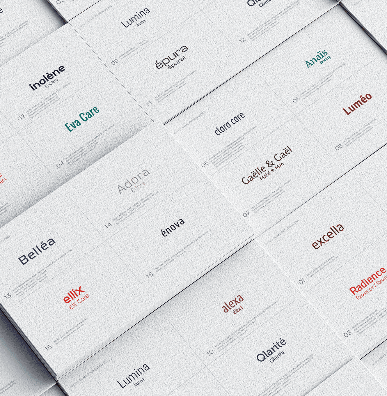
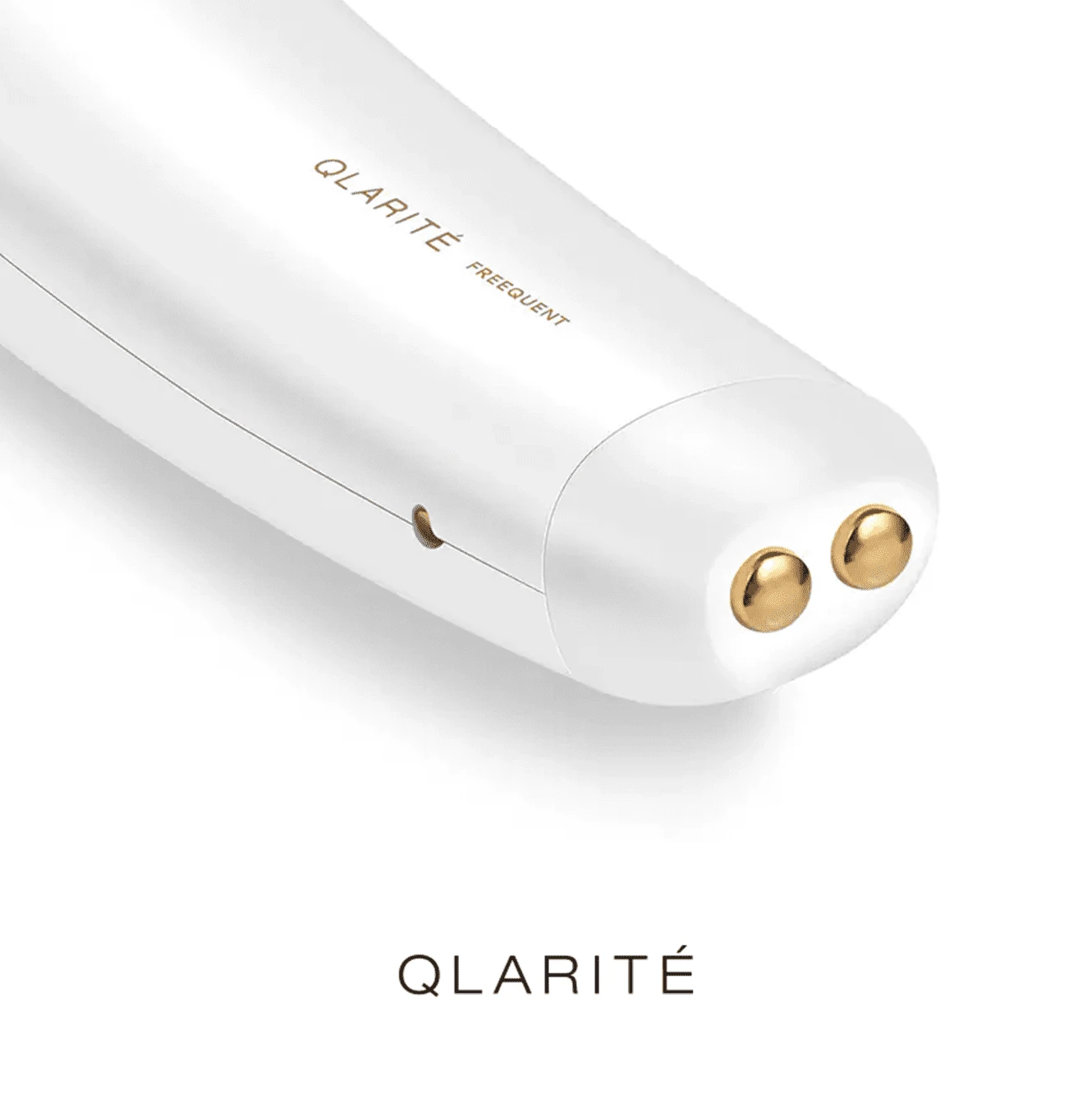
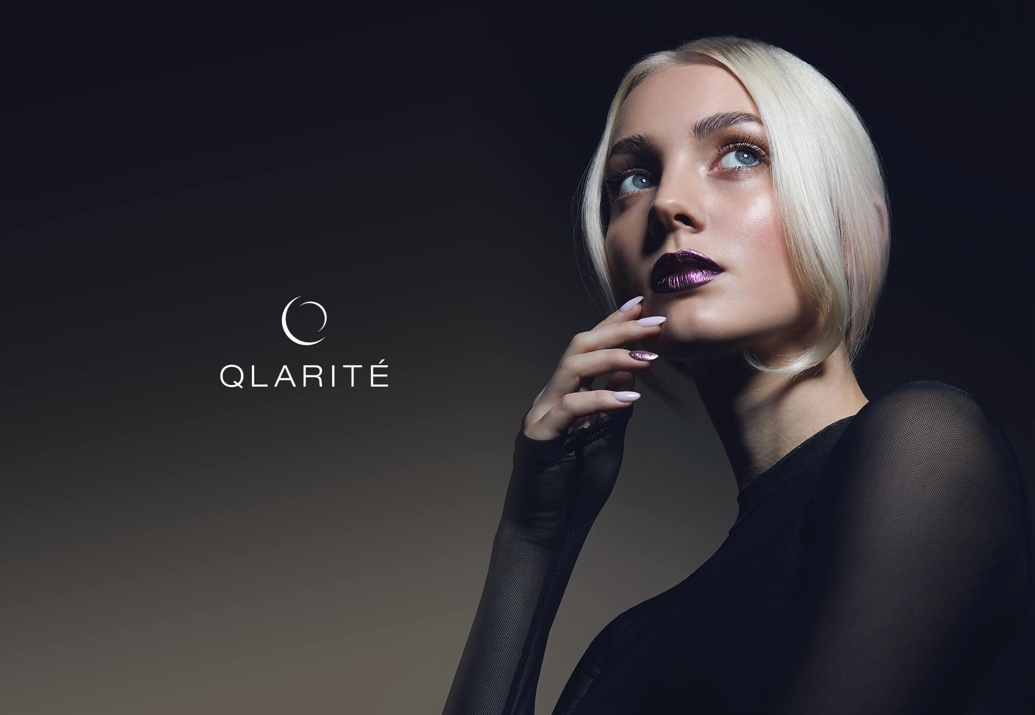
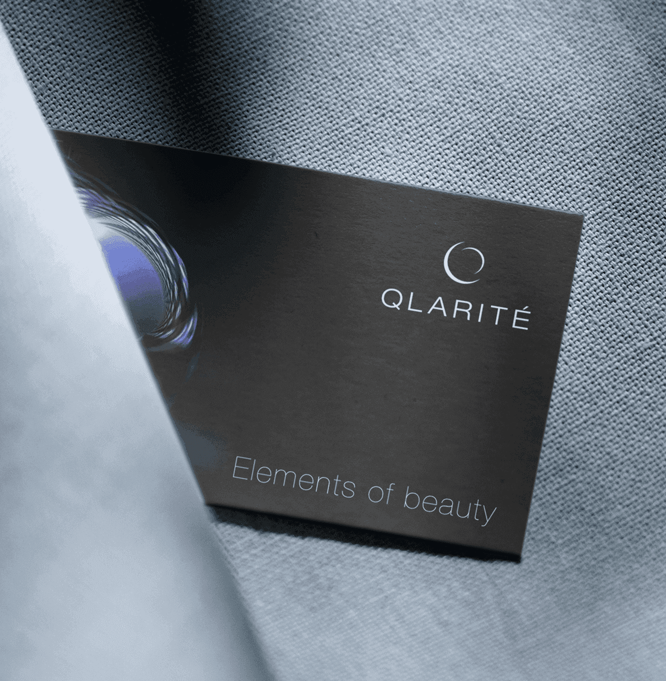
The primary criterion for the name was simplicity with a French meaning and connotation, coupled with the availability of a concise .com domain. We settled on “QLARITE” (derived from “clarite” in French), translating to “transparency.” To infuse uniqueness, we replaced the letter ‘C’ with ‘Q,’ maintaining the same pronunciation. Notably, we secured the domain www.Qlarite.com, aligning our linguistic and branding goals seamlessly.

Logo & Packaging Design: Minimalist Branding with a High-Tech Edge

Logo & Packaging Design: Minimalist Branding with a High-Tech Edge

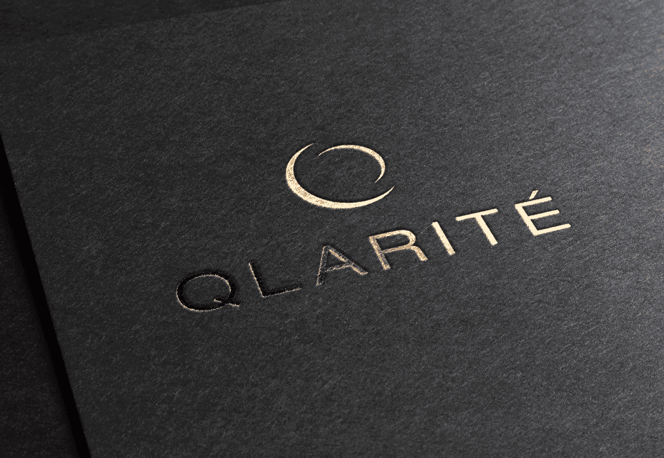
In crafting the logo design, we aimed to embody the purity and simplicity encapsulated in the name’s meaning. Our choice is a straightforward symbol, placing emphasis on the Q for its simplicity and effectiveness. The font selected is a clean and simple slim Helvetica, with a distinctive accent on the letter E, serving as a nod to the brand’s French heritage.

This design approach ensures a visually compelling representation that aligns seamlessly with the brand’s essence. In the final phase of the project, our focus shifted to crafting the primary packaging design. The aesthetic remains minimalistic and refined, predominantly featuring black as the main color. A pivotal visual element is a 3D illustration of the product, serving as a key focal point. The overall look maintains a professional, sleek, and high-tech vibe, accentuated by a subtle technological touch. This design approach ensures that the packaging aligns seamlessly with the brand’s identity, offering a clean and sophisticated presentation.

This design approach ensures a visually compelling representation that aligns seamlessly with the brand’s essence. In the final phase of the project, our focus shifted to crafting the primary packaging design. The aesthetic remains minimalistic and refined, predominantly featuring black as the main color. A pivotal visual element is a 3D illustration of the product, serving as a key focal point. The overall look maintains a professional, sleek, and high-tech vibe, accentuated by a subtle technological touch. This design approach ensures that the packaging aligns seamlessly with the brand’s identity, offering a clean and sophisticated presentation.

This design approach ensures a visually compelling representation that aligns seamlessly with the brand’s essence. In the final phase of the project, our focus shifted to crafting the primary packaging design. The aesthetic remains minimalistic and refined, predominantly featuring black as the main color. A pivotal visual element is a 3D illustration of the product, serving as a key focal point. The overall look maintains a professional, sleek, and high-tech vibe, accentuated by a subtle technological touch. This design approach ensures that the packaging aligns seamlessly with the brand’s identity, offering a clean and sophisticated presentation.

Have a project in mind?

By submitting, you agree to our Terms and Privacy Policy.

Let’s talk.

Whether you need branding, a new website, or digital marketing, our team collaborates with you to turn ideas into results that connect and create lasting impact.

Quick response.

Prompt and collaborative, we ensure a clear understanding of your project.

Clear next steps.

Following consultation, you’ll receive a clear proposal with timeline.